Google Cloud tech channel
A YouTube channel with over one million subscribers provides daily educational content for developers worldwide, covering the latest technology through new series and episodes.
Visit Google Cloud tech channel
Visit Google Cloud tech channel
Personal anecdote
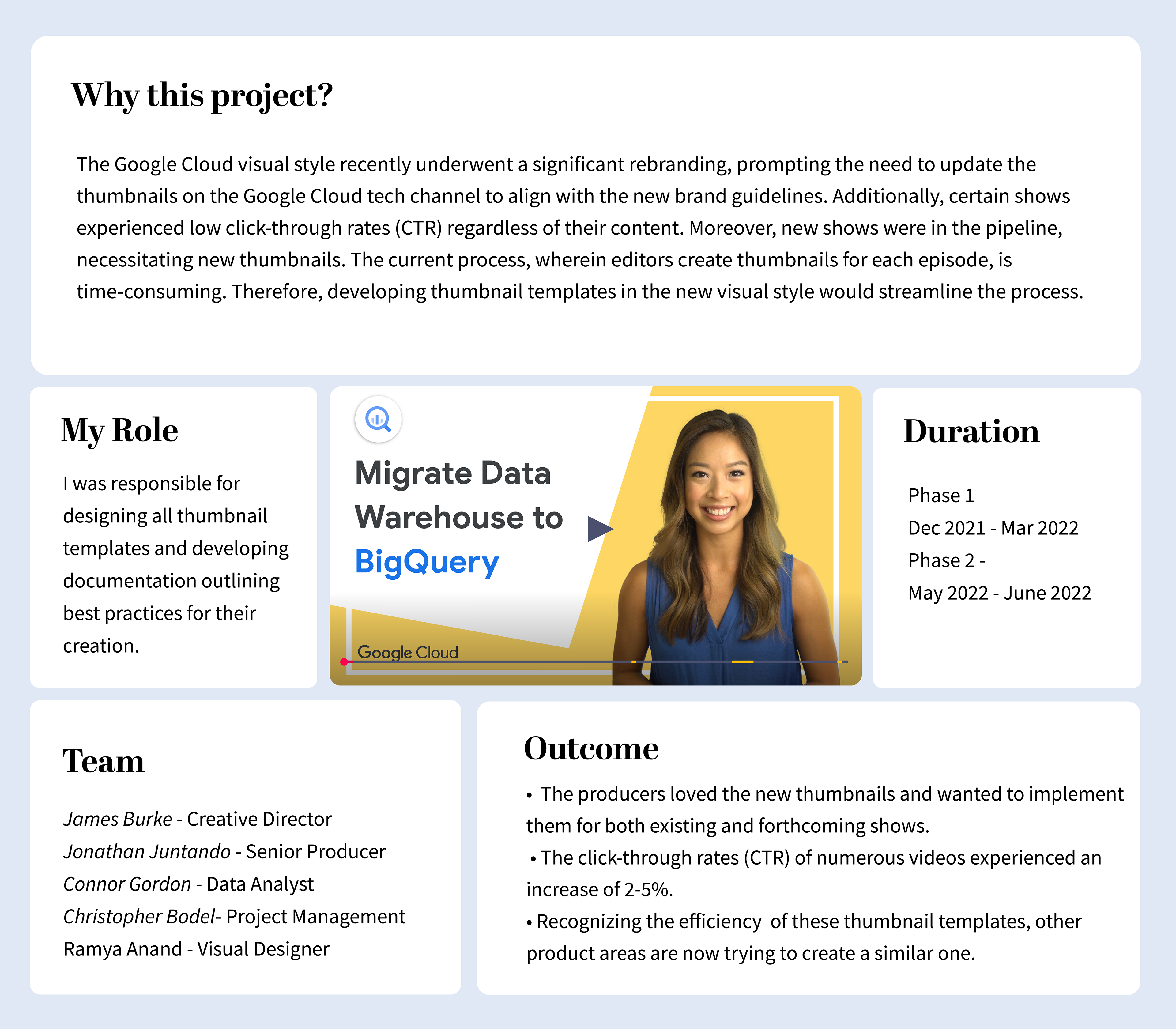
My first big project for Google
This project holds significance as it marks the first major task assigned to me upon joining the Google for Developers team at Google. With Google Cloud undergoing a significant rebrand, it was time to revamp all assets, including thumbnail templates, illustration library, and motion graphics. Experiencing a mix of nervousness and excitement, I aimed to make a stellar first impression within the team.
R e s e a r c h
Understanding Our Audience: Decoding Young Developers' Needs
We knew our target audience was young developers and students. Data confirmed their preference for videos like "Getting Started" and introductions. This meant clear, valuable content that resonated with their learning journey. But how could thumbnails translate that message? Here's what mattered:
Building Trust & Authority:
A professional, polished look was essential to convey expertise and the value viewers could expect.
A professional, polished look was essential to convey expertise and the value viewers could expect.
Attention Grabbing Appeal:
Attention spans are short and hence thumbnails have to be visually engaging to grab viewers' attention while
browsing YouTube.
Attention spans are short and hence thumbnails have to be visually engaging to grab viewers' attention while
browsing YouTube.
Brand Recognition Through Consistency:
A uniform visual style across all thumbnails would make the Good Cloud Tech brand instantly recognizable, maximizing clicks from browsing features (Over 60% of successful video views come from YouTube browsing features.)
A uniform visual style across all thumbnails would make the Good Cloud Tech brand instantly recognizable, maximizing clicks from browsing features (Over 60% of successful video views come from YouTube browsing features.)
Data driven insights: Understanding the cause of low CTR
Collaboration with our digital content manager, Connor, unlocked valuable insights:
Inconsistent Identity:
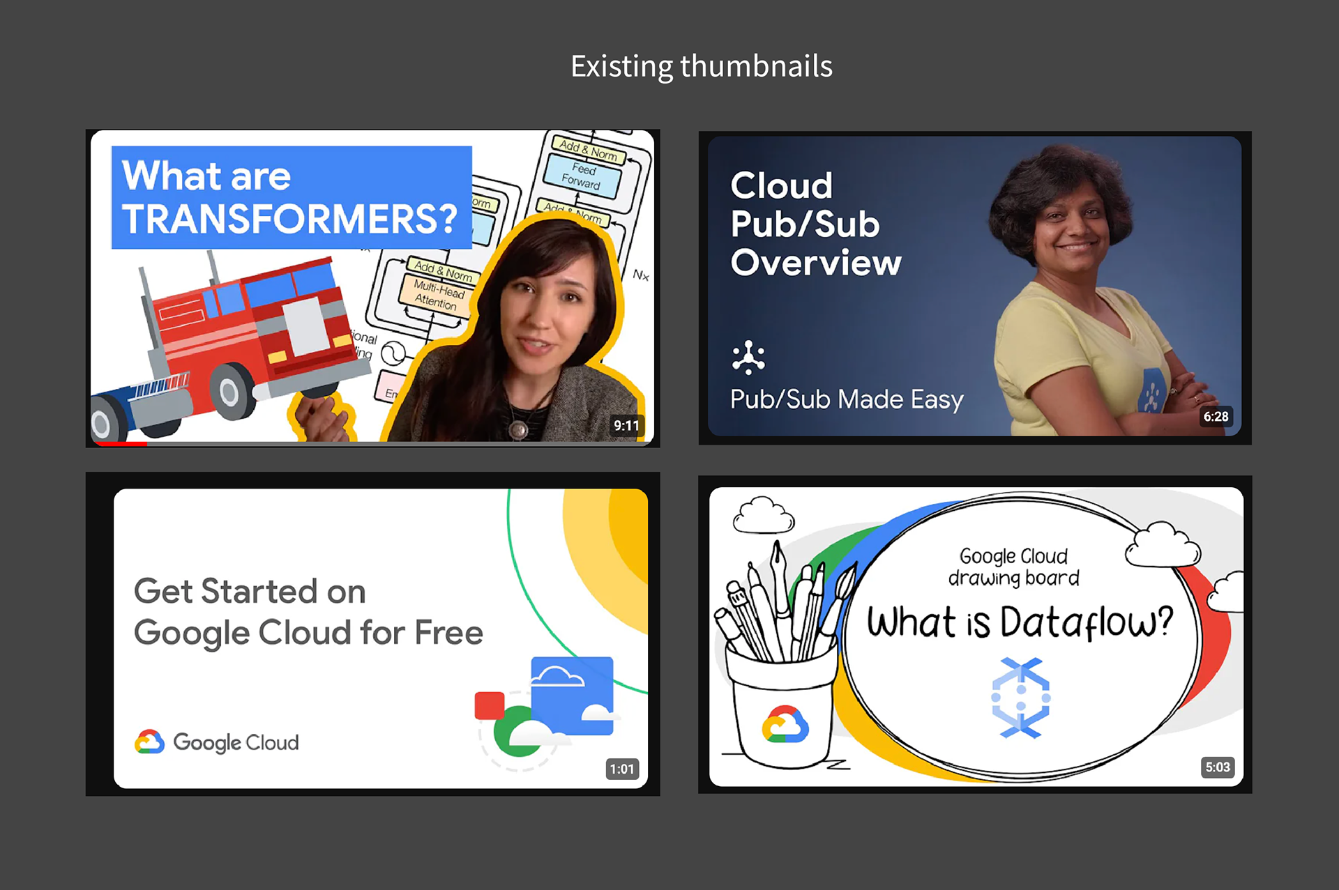
Existing thumbnails lacked a cohesive style, projecting a fragmented brand image.
Existing thumbnails lacked a cohesive style, projecting a fragmented brand image.
Underperforming Non-Speaker Thumbnails:
Videos without a presenter often featured weak visuals, leading to lower CTRs.
Videos without a presenter often featured weak visuals, leading to lower CTRs.
Stale Series Design:
Repetitive designs for ongoing series might have caused viewers to lose interest.
Repetitive designs for ongoing series might have caused viewers to lose interest.
Lessons from current top performing thumbnails
By analyzing the channel's most successful thumbnails, we uncovered insights that would guide our template design:
Simplicity Reigns Supreme:
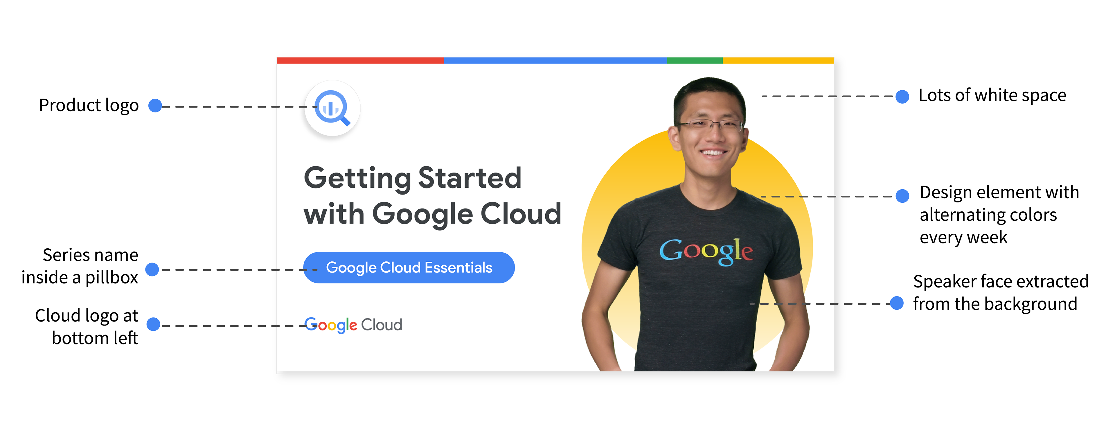
Clean layouts with ample white space and minimal text emerged as clear winners, ensuring viewers could easily grasp the video's content.
Clean layouts with ample white space and minimal text emerged as clear winners, ensuring viewers could easily grasp the video's content.
Accommodating Guests:
Series featuring both a speaker and a guest highlighted the need for templates that could incorporate two individuals.
Series featuring both a speaker and a guest highlighted the need for templates that could incorporate two individuals.
The Power of Contrast:
Eye-catching thumbnails relied on a strategic use of contrasting title text, color schemes, and overall layout to grab attention in a crowded landscape.
Eye-catching thumbnails relied on a strategic use of contrasting title text, color schemes, and overall layout to grab attention in a crowded landscape.
Series Recognition Matters:
Including the series name directly in the thumbnail fostered a stronger connection with viewers who already followed specific shows.
Including the series name directly in the thumbnail fostered a stronger connection with viewers who already followed specific shows.
Mobile-First Design:
Accessibility standards were paramount, considering the thumbnails would be viewed primarily on mobile devices. This meant using minimal elements that were still large enough to be easily understood.
Accessibility standards were paramount, considering the thumbnails would be viewed primarily on mobile devices. This meant using minimal elements that were still large enough to be easily understood.
Exploration and Implementation
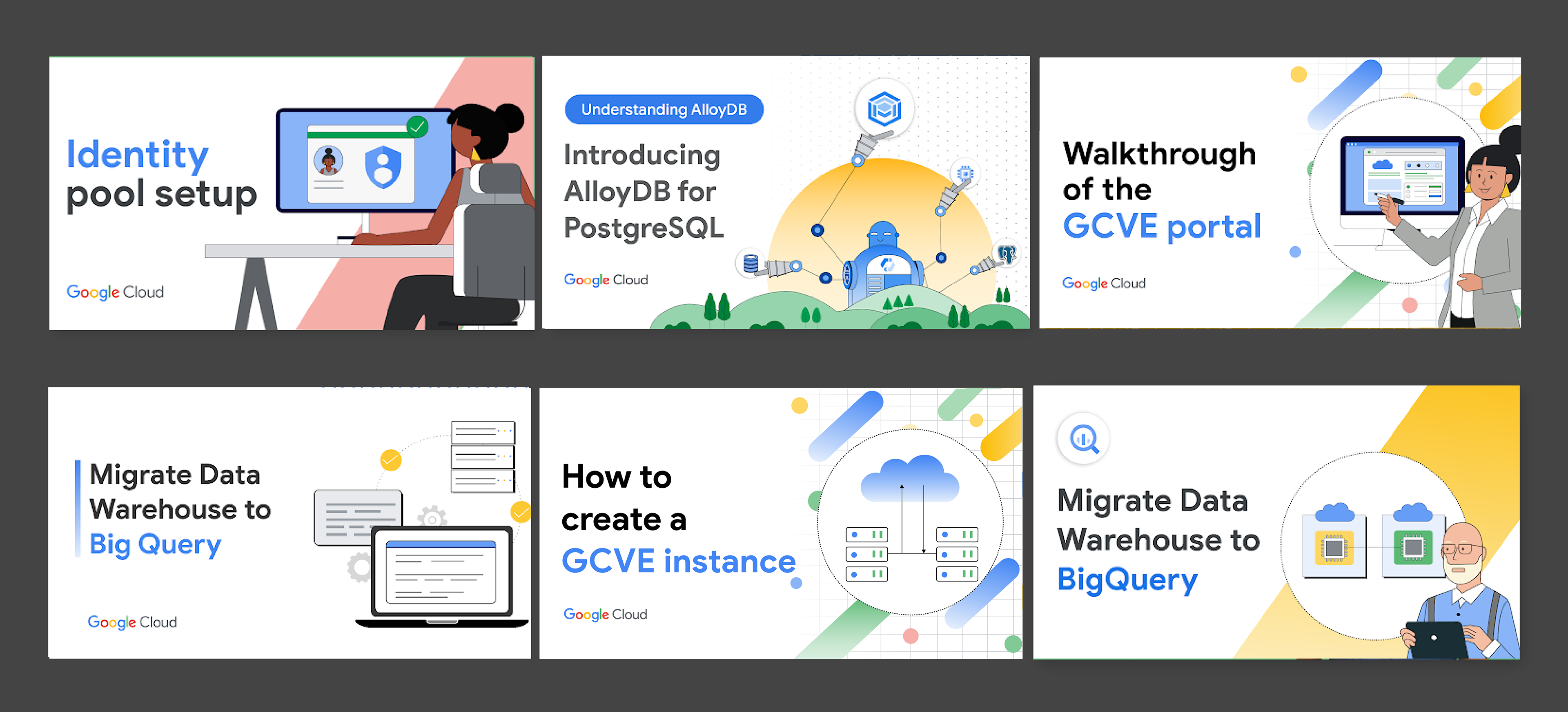
Initial designs
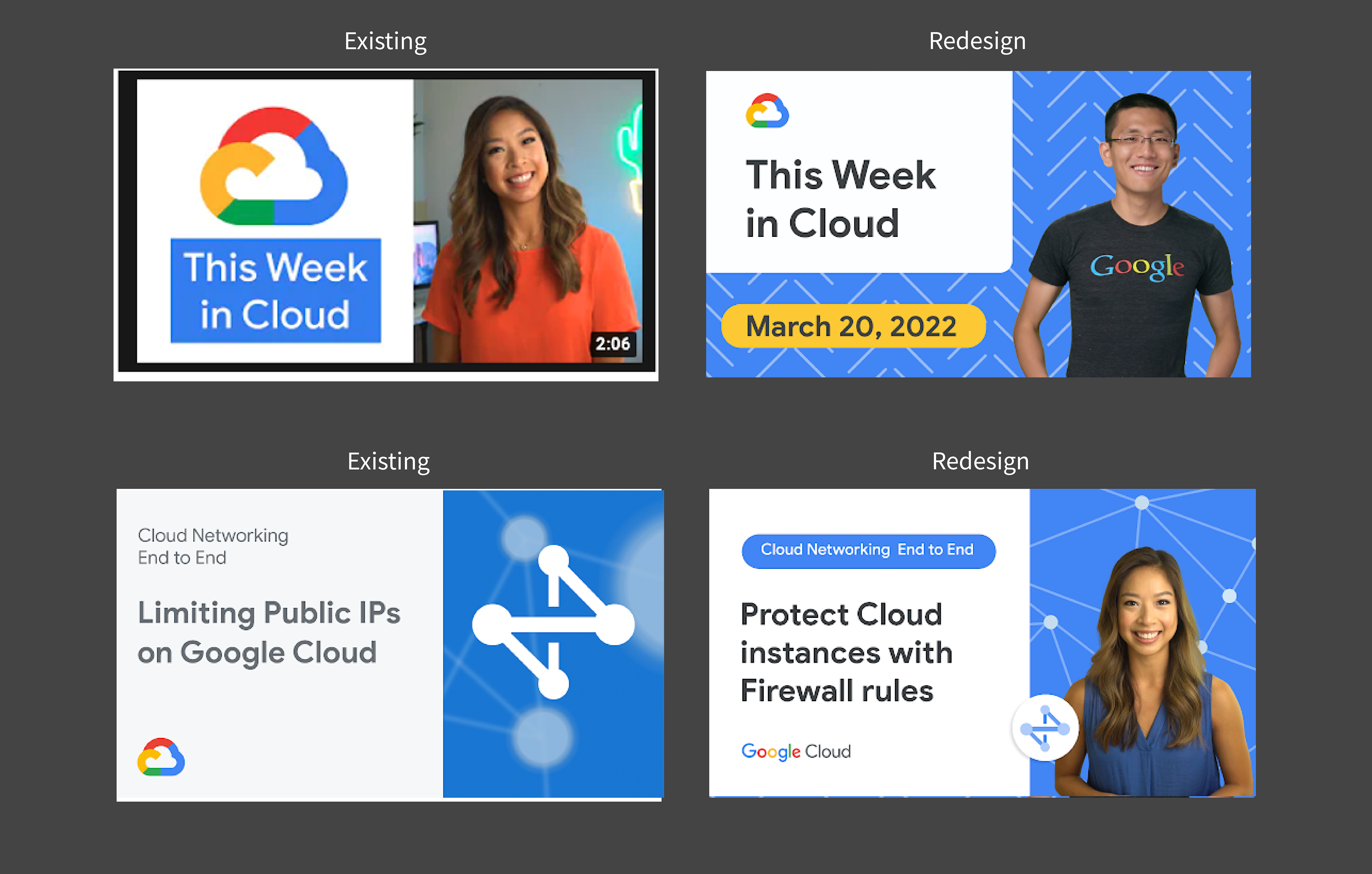
Making informed decisions: A/B Testing for Optimization
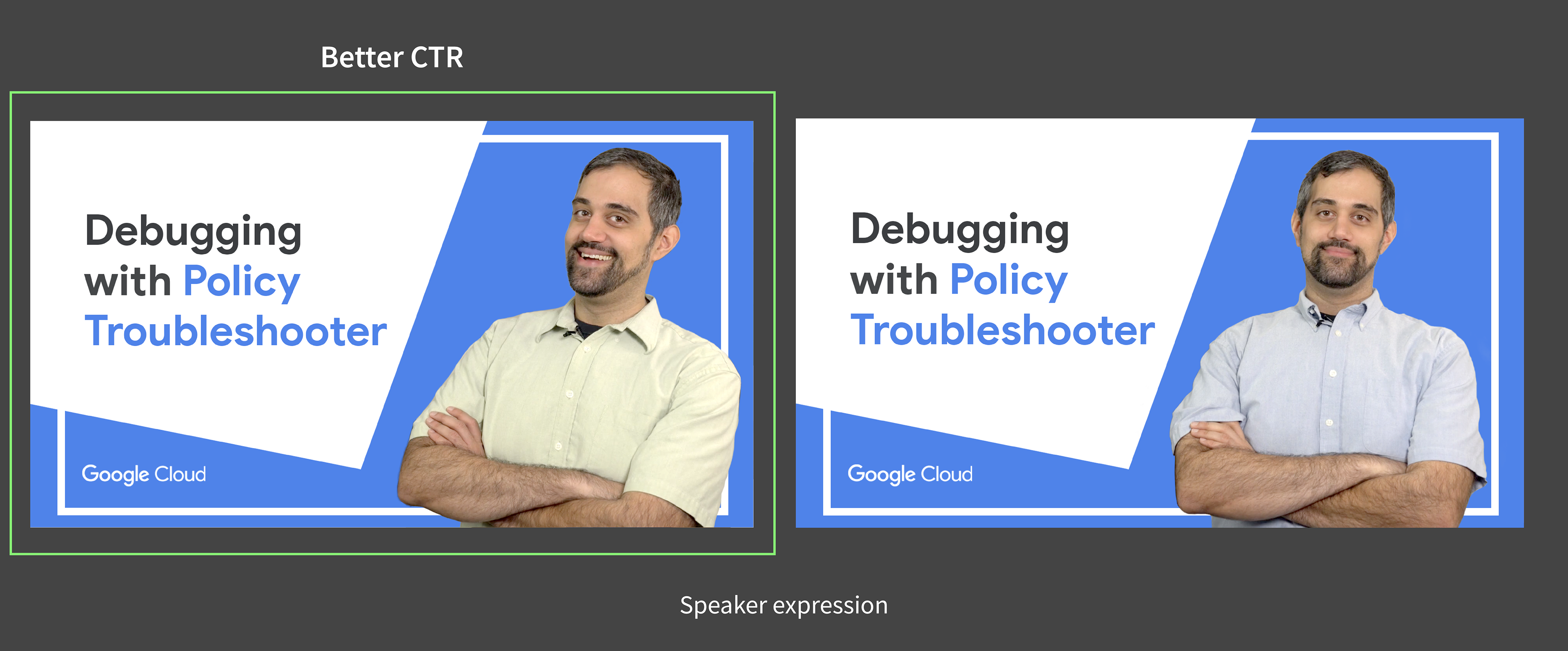
To make data-driven decisions, we employed A/B testing. We created two variations of the same thumbnail: one featuring the speaker's face with the background intact, and another with the speaker's face extracted from the background. Each variation was shown to 50% of viewers, and we used TubeBuddy to track click-through rates (CTR) and determine which version performed better.
Speaker Choice: Cut-Out vs. Background:
A/B testing confirmed the hypothesis – clean speaker cut-outs performed better, leading to CTR increase.
A/B testing confirmed the hypothesis – clean speaker cut-outs performed better, leading to CTR increase.
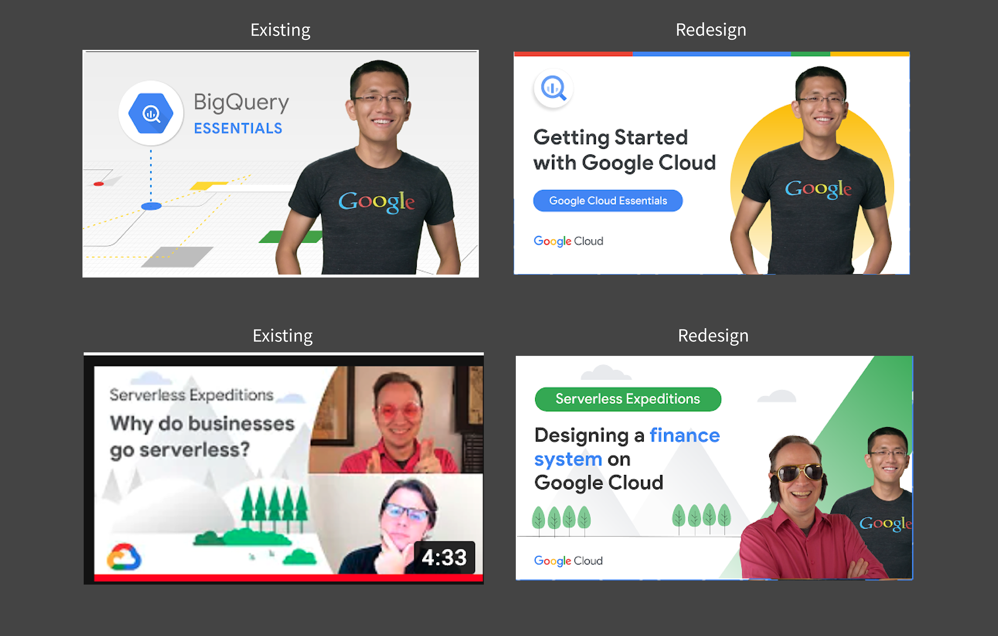
Product Icons & Presenter Poses:
Similar tests helped determine the impact of these elements on user trust and click-through rates.
Similar tests helped determine the impact of these elements on user trust and click-through rates.


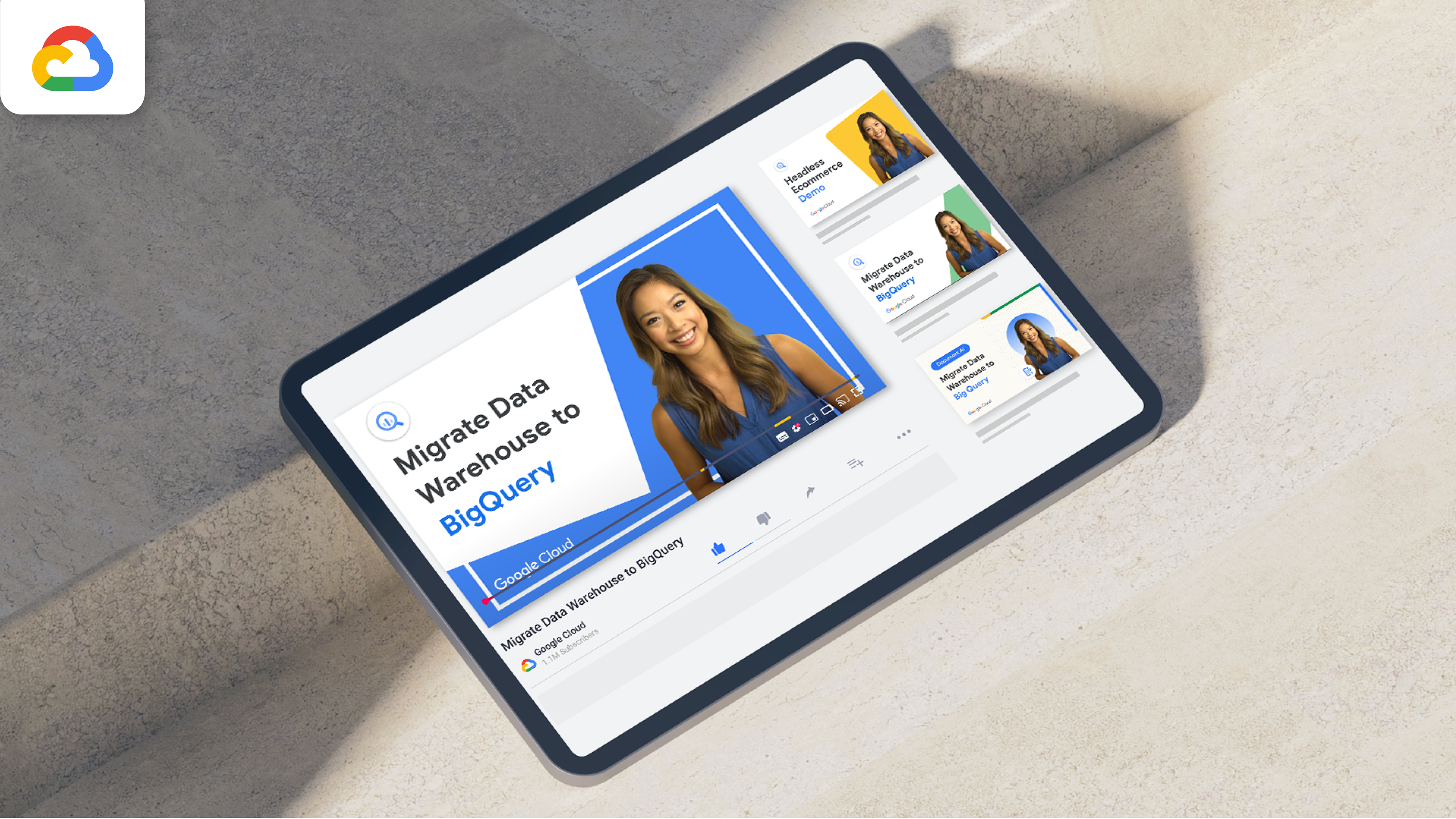
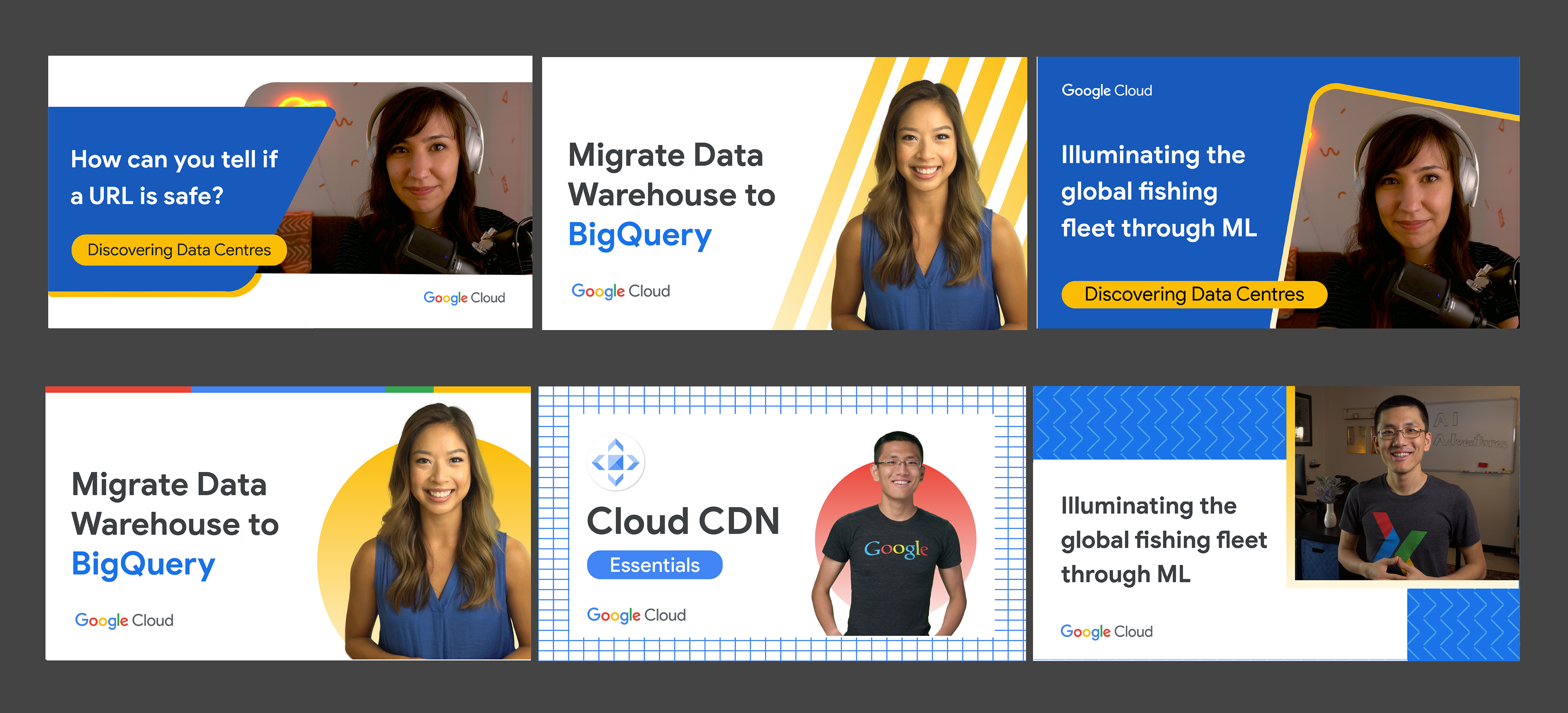
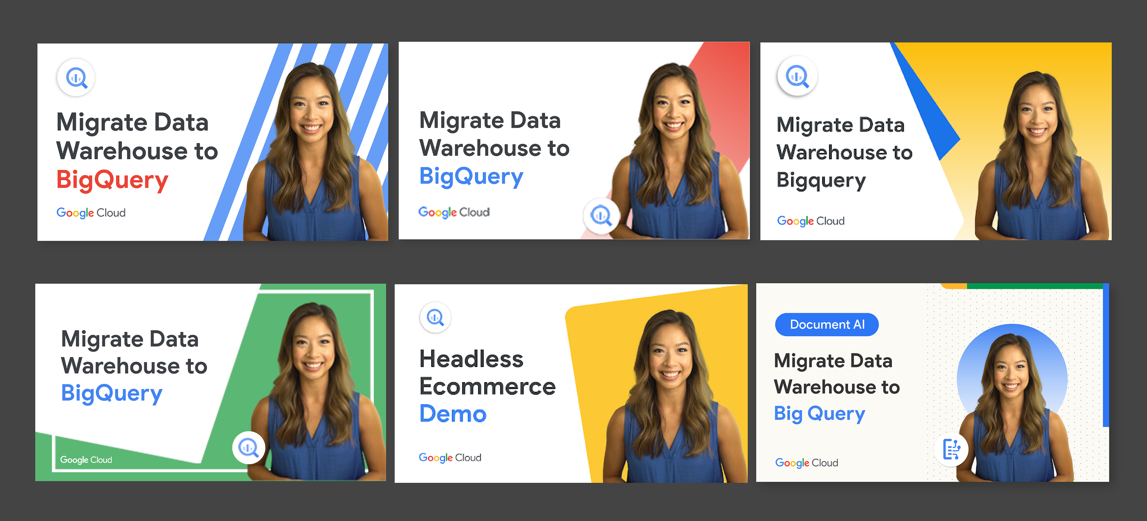
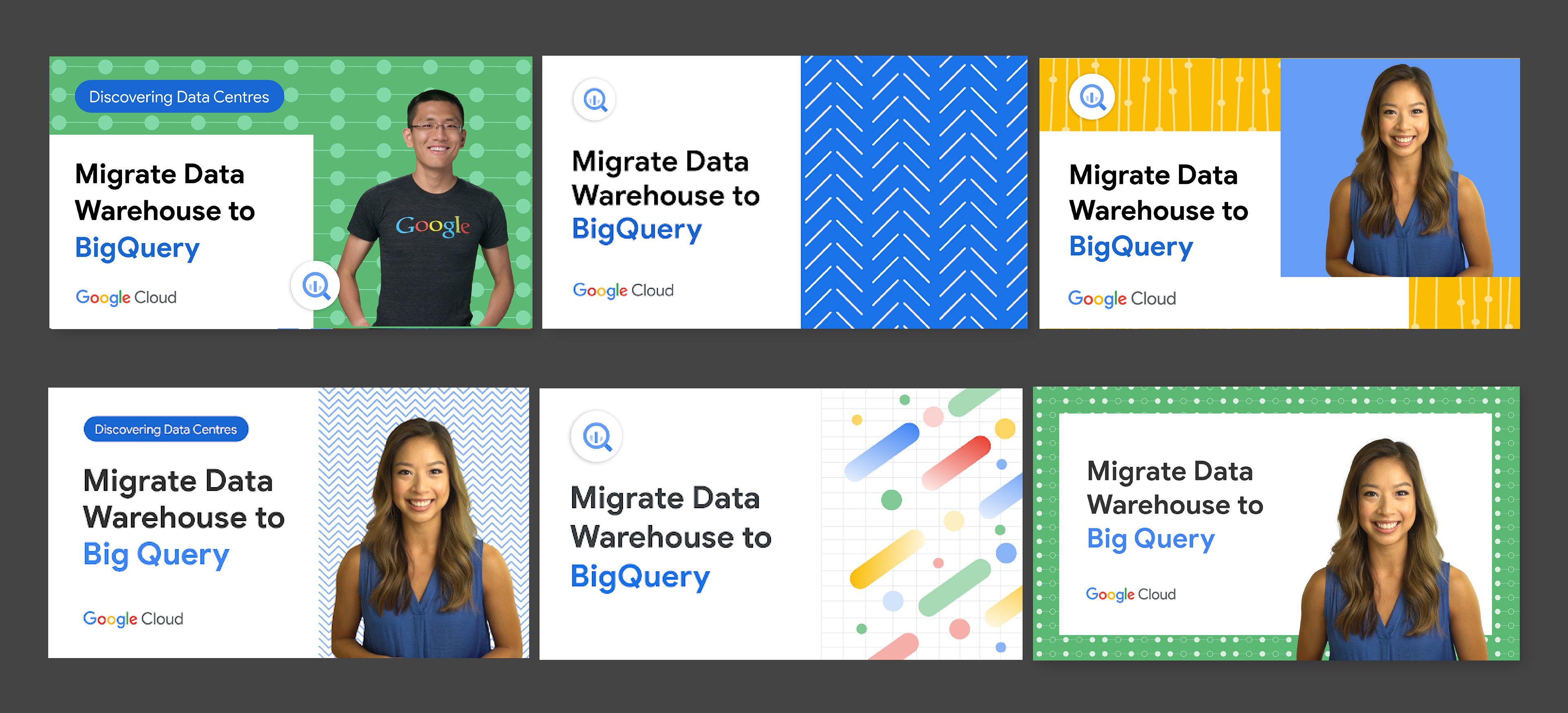
Building a foundational template
With a solid understanding of what worked, we built a foundational template structure. Design elements and colors could be easily swapped to create diverse templates. Additionally, the iconic Google color palette offered a weekly rotation option for series thumbnails.
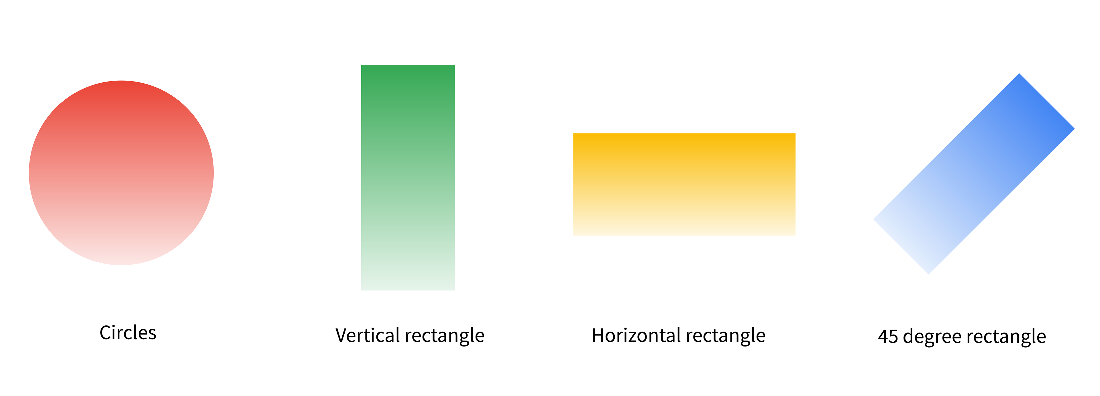
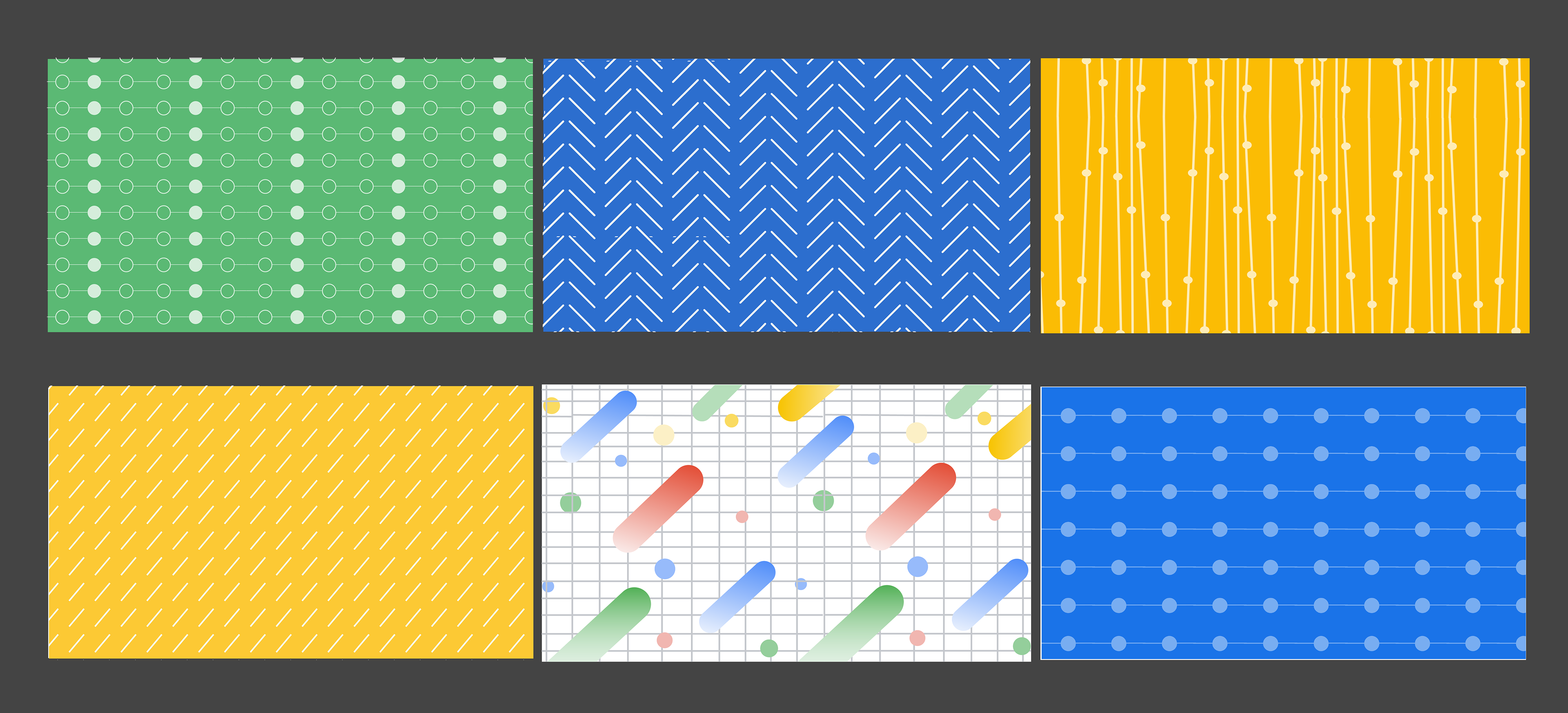
Thumbnails with patterns
To further expand possibilities, we explored incorporating simple patterns, validated through A/B testing.
Beyond Faces: Boosting CTR of non-speaker thumbnails
Demo and talk videos often lack a speaker’s face leading to lower CTR. Recognizing this performance gap, we looked beyond speaker faces. During this project, I was also developing a character library that aligned with the new cloud style. These illustrations proved to be effective substitutes for speaker faces in non-speaker thumbnails, boosting CTR.
Revamping Popular series: Balancing Familiarity with Freshness
Popular series had established a visual identity that viewers recognized. The goal was to maintain that familiarity while incorporating the new branding. The foundational template made this process efficient, allowing for a seamless refresh.
Phase 2: Streamlining the Workflow
Beyond design, optimizing the thumbnail creation process was essential
Easy-to-Use Templates:
Photoshop templates with editable layers empowered both designers and non-designers to create thumbnails in
under 30 minutes.
Photoshop templates with editable layers empowered both designers and non-designers to create thumbnails in
under 30 minutes.
Best Practices Documentation:
A comprehensive document served as a single source of truth for all teams involved in thumbnail creation.
A comprehensive document served as a single source of truth for all teams involved in thumbnail creation.
Queue Management:
Furthermore, we collaborated with producers and project managers to establish a thumbnail management queue. This queue initiates a thumbnail creation task immediately after the video shoot concludes, ensuring timely and efficient thumbnail production.
Furthermore, we collaborated with producers and project managers to establish a thumbnail management queue. This queue initiates a thumbnail creation task immediately after the video shoot concludes, ensuring timely and efficient thumbnail production.
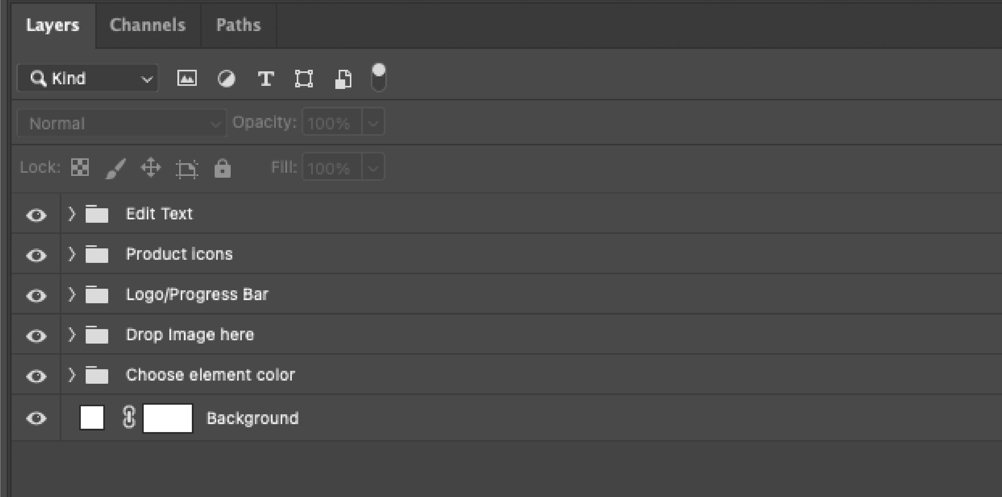
Screenshot of Photoshop template
Outcome
Top 3 Video Placements:
Redesigned thumbnails consistently secured top 3 placements in YouTube search results.
Redesigned thumbnails consistently secured top 3 placements in YouTube search results.
Enhanced Browse Feature Views:
Increased views from YouTube's browse features indicated stronger video recommendations.
Increased views from YouTube's browse features indicated stronger video recommendations.
Overall CTR Boost:
The channel's overall CTR jumped by 4-5%.
The channel's overall CTR jumped by 4-5%.
1 Million Subscriber reached:
Within 9 months, the channel achieved its 1 million subscriber goal, fueled by engaging content, thumbnail optimization, and a focus on beginner-friendly content.
Within 9 months, the channel achieved its 1 million subscriber goal, fueled by engaging content, thumbnail optimization, and a focus on beginner-friendly content.