personal anecdote
Difficult to keep track of subscriptions
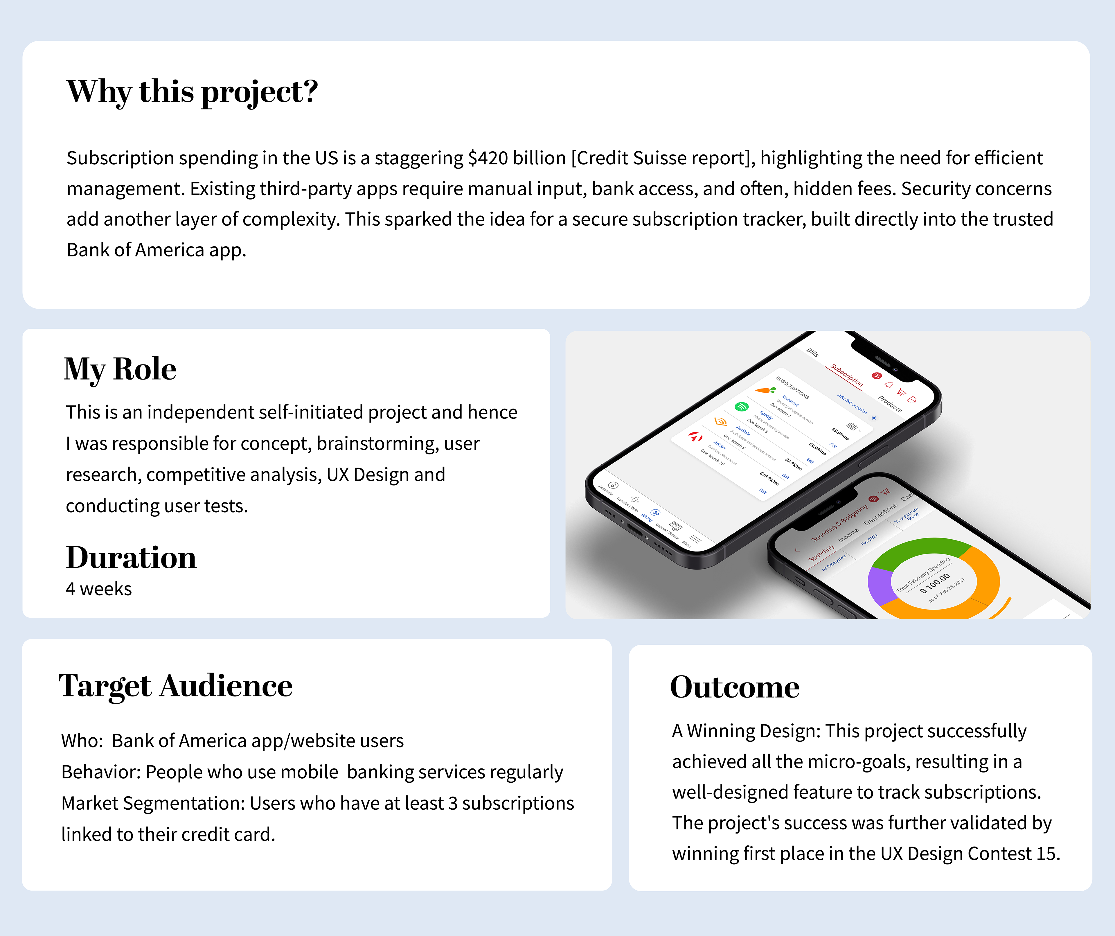
During lockdown, a surge in online subscriptions quickly spiraled out of control. Two hours poring over my bank statement revealed a shocking truth: I was paying for services I didn't use! Free trials turned into hidden charges, and managing it all felt impossible. Third-party apps offered a solution, but trust concerns lingered. This sparked the idea for a secure subscription tracker, built directly into the trusted Bank of America app.
Disclaimer: This project is an exploration of an idea, not created for an actual deployment on the Bank of America app as I have no affiliations with Bank of America. I acknowledge that the views expressed in this case study are strictly my own.

research
Current Solution Analysis
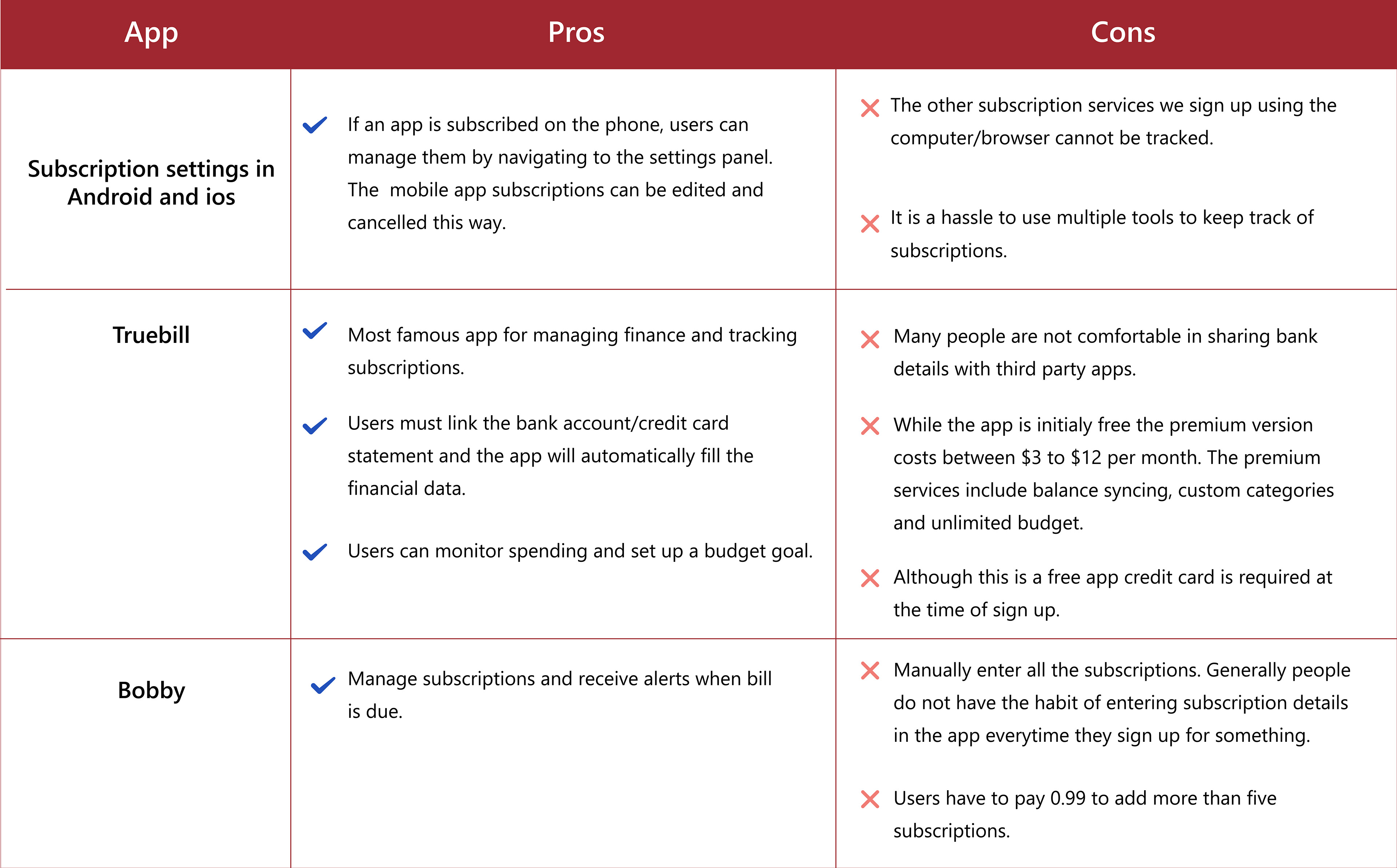
I analyzed popular apps like TrueBill and Bobby. While well-designed, they lacked:
Automated Tracking: Manual input is time-consuming.
Security: Granting bank access raises privacy concerns.
Transparency: Free versions often limit features, leading to hidden costs.
The Solution: A Secure Haven Within Your Bank
Bank of America, a trusted financial institution with robust security, presented the perfect platform. Integrating a subscription tracker would keep users in control:
Leveraging Existing Trust: People trust their bank's security measures.
Seamless Integration: Familiarity with the BOA app fosters easy adoption.
Centralized Management: Manage all finances in one secure location.

understanding user needs
Uncovering User Pain Points: Beyond Assumptions
Online surveys often fall short in finance-related matters. To avoid bias, I interviewed friends and current BOA app users:
Prioritization: Viewing due dates and receiving pre-payment alerts were key features.
Deeper Insights: Users desired billing history, including signup dates and total months paid.
Alternative Tracking Methods: Insights included using Google Calendars for alerts and the Mint app's tracking features.
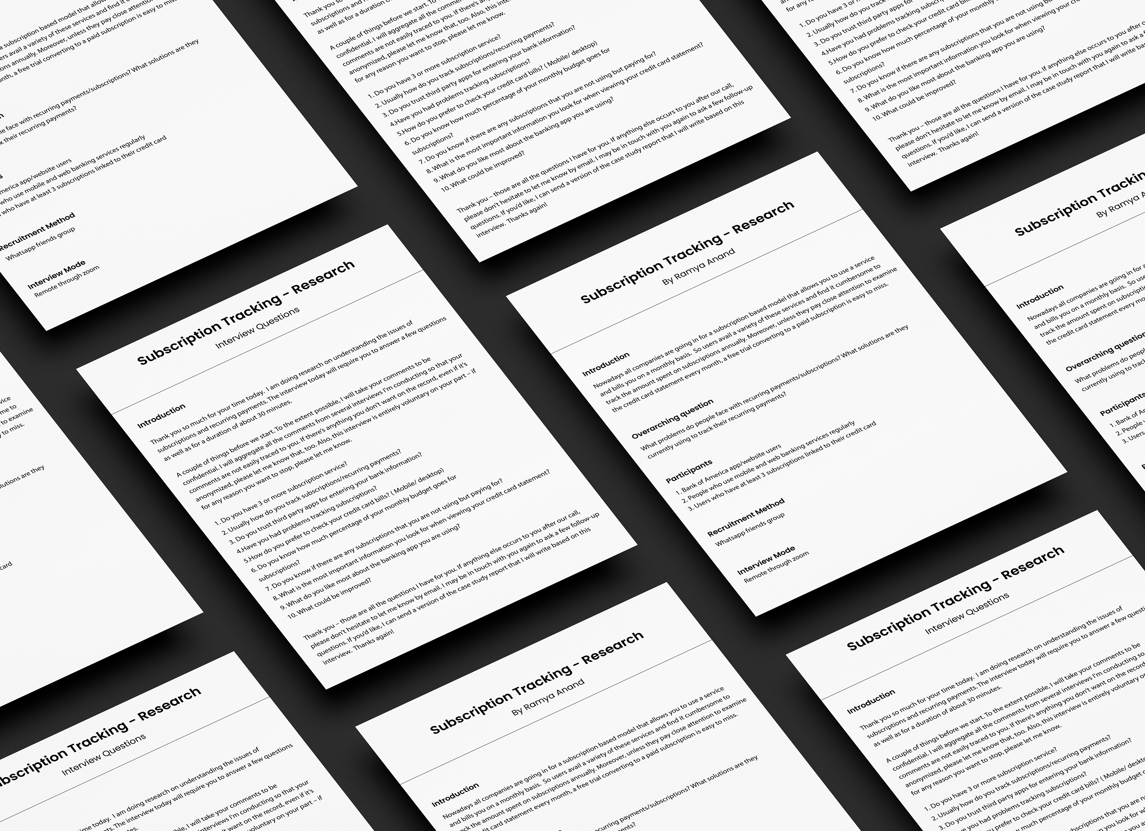
Interview Protocol
Here are some of the quotes by the participants:
" It's a daunting task to cancel a transaction by calling the customer care."
" I am not comfortable in sharing my bank details with a third-party app."
" I am not sure how much percentage of the budget goes towards subscriptions. I think it will be 5-10%."
" It is very difficult to go through bank statements every month to track subscriptions."
"A text reminder of a recurring payment, before it hits my account will be beneficial."
User-centered goals and actionable steps
These micro goals are prioritized based on the user needs assessment and competitor analysis
Track Subscriptions Easily: Shine a light on recurring payments with a dedicated tab.
Effortless Management: Empower users to rename, categorize, and cancel subscriptions with ease.
Avoid Hidden Fees: Set pre-payment reminders to avoid unwanted charges.
Monitor Spending: Gain insights into monthly subscription spending.
Catch Missed Expenses: Ability to manually add subscriptions the bank might miss.
All of the above micro-goals have to be achieved by minimally changing the existing interface of the app.

Design
Mapping the user journey
Mapping the User Journey: To understand how users would navigate the app to achieve the five micro-goals, I delved into existing apps like TrueBill and Intuit, analyzing their interface and user flows. This research served as a blueprint as I sketched out five user flows for the Bank of America app. Each flow mapped a goal (e.g., track subscriptions) to its starting point (e.g., a dedicated "Subscriptions" tab) to ensure a seamless user experience.
Meet Kathy ( Ideal User)
Kathy, our 35-year-old software engineer, juggles work, kids, and a post-lockdown subscription explosion. Understanding her needs through a user persona helped design a solution that resonated.
Kathy, our 35-year-old software engineer, juggles work, kids, and a post-lockdown subscription explosion. Understanding her needs through a user persona helped design a solution that resonated.
Writing a scenario and creating an ideal user profile helped me to understand the audiences' needs and situation better.

Challenge - 1
Where to position this feature inside the app for maximum benefit?
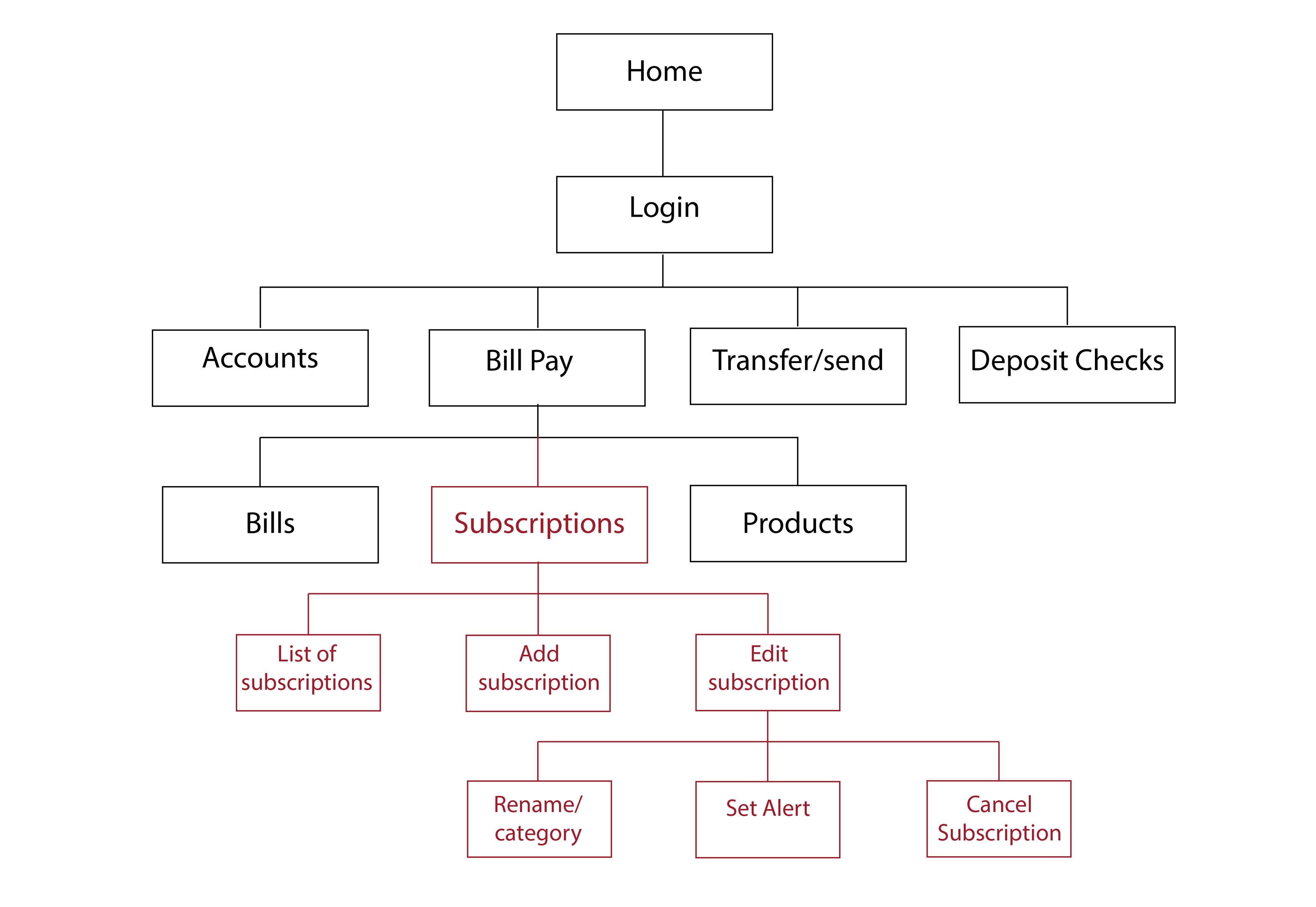
Placing the feature for maximum impact was crucial. Hiding it within transaction filters wouldn't do. To ensure easy discovery and drive user engagement, I analyzed how BOA and other financial apps categorize features. This led to the decision to position the subscription tracker as a clear tab under "Bill Pay." This location aligns with users' expectations and makes it readily accessible.
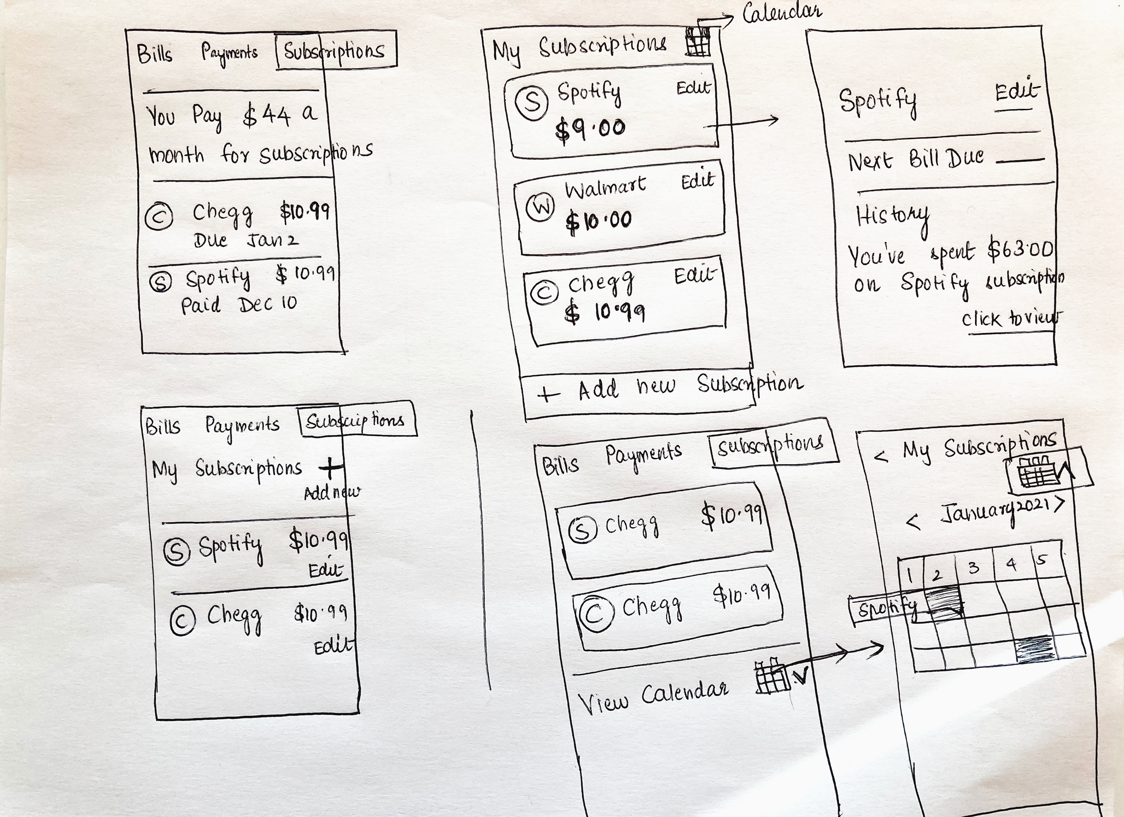
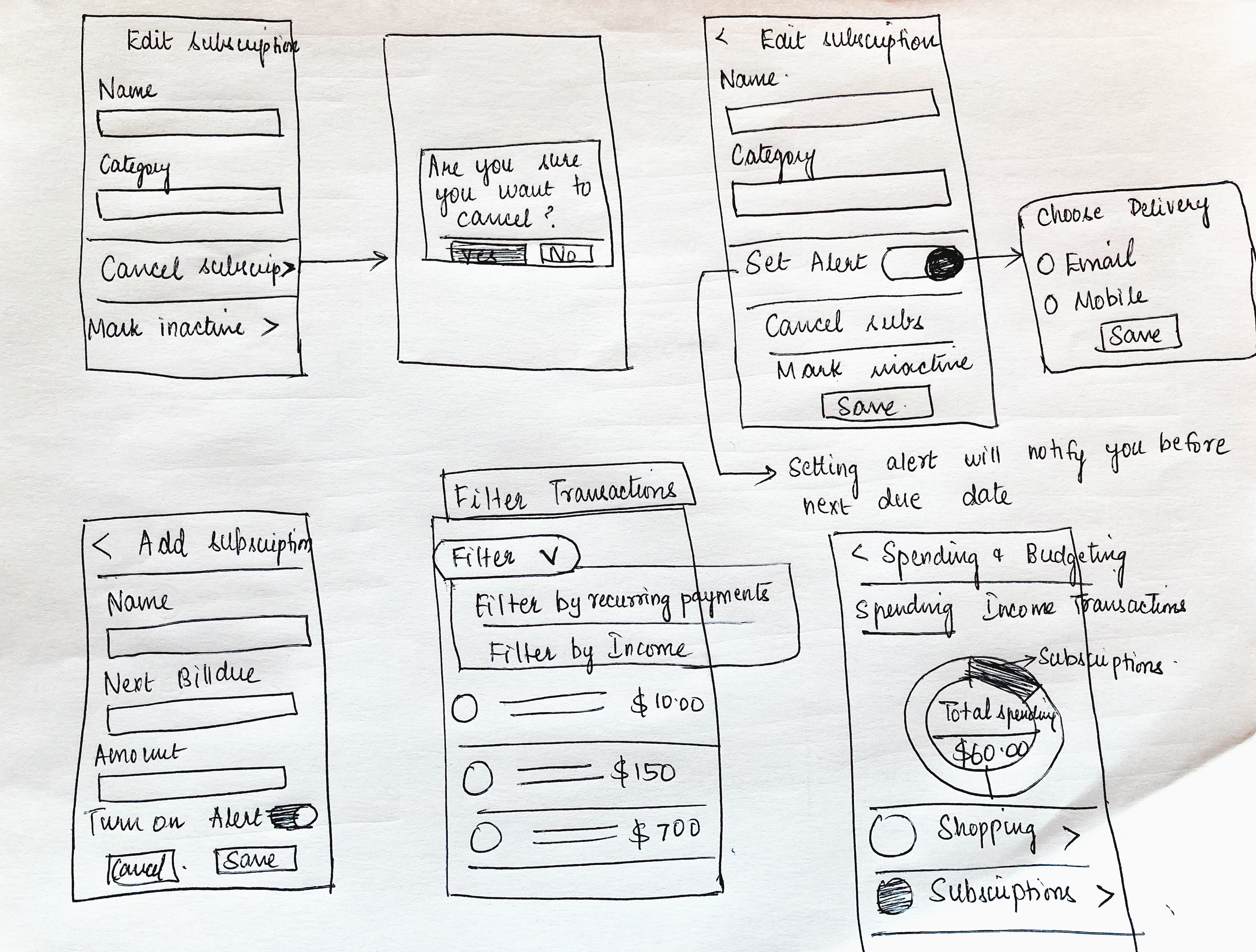
Wireframes
Exploring the solution ideas through sketches
Final Design
Let's see how Kathy( persona) navigates through the app to complete the above micro goals
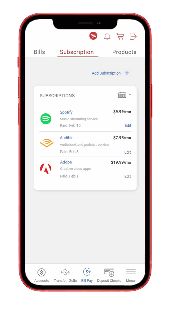
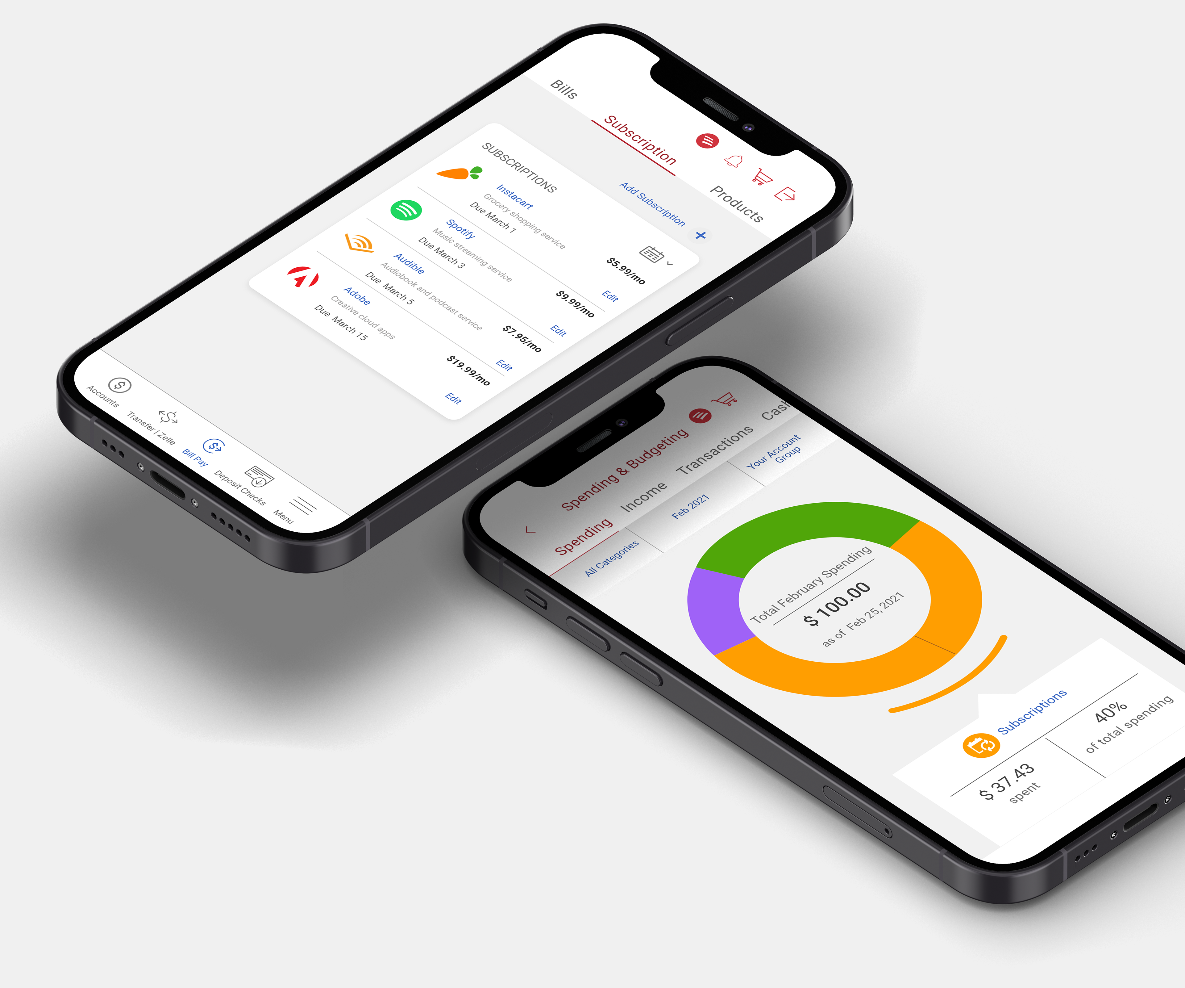
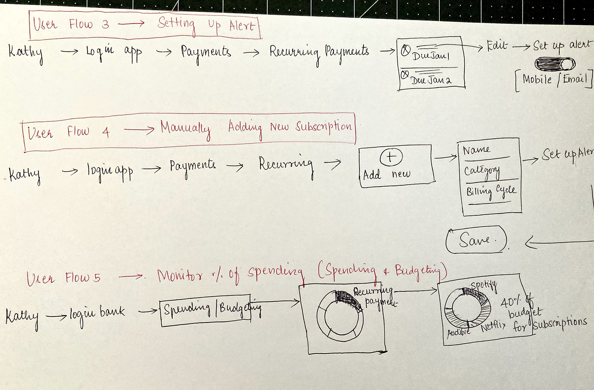
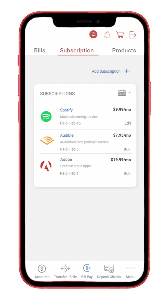
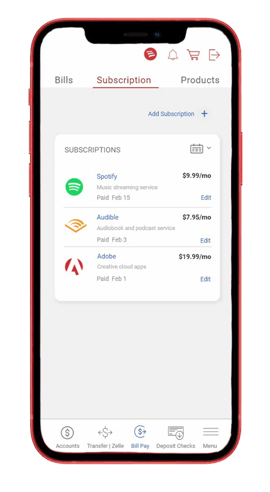
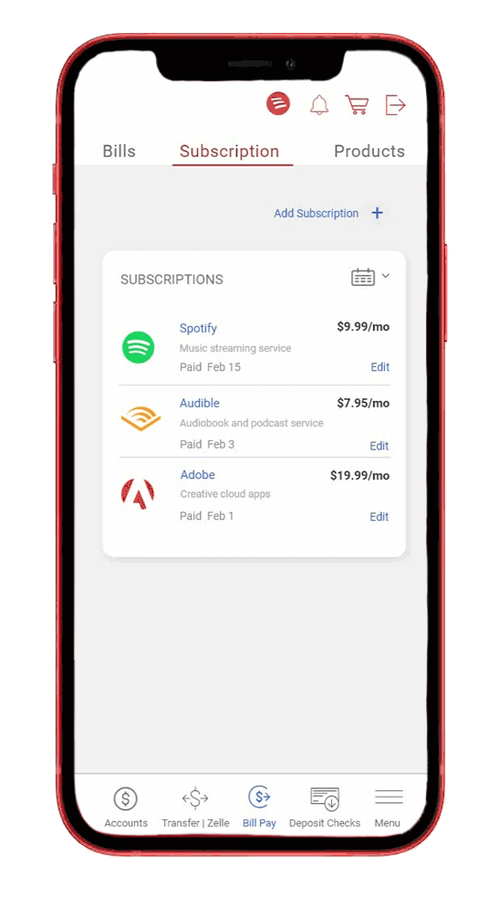
Flow 1: Tracking Subscriptions
Kathy logs in, clicks the "Subscriptions" tab, and sees a clear list with edit options. A calendar view helps her track upcoming bills.
Flow 2 - Cancel a subscription
Kathy wishes to cancel her Spotify subscription and hence she goes to the edit menu. She sees the cancel subscription option and clicks it. An error prevention message is displayed to prevent Kathy from accidentally cancelling the subscription.
Flow 3 - Set Reminder Alert
Kathy wanted to set text alert for a trial subscription so that she can cancel it before her card is charged. She turns on the set alert switch in the edit subscription screen and chooses her alert mode as email.
Flow 4 - Manually Add a Subscription
Kathy wants to add her new Instacart subscription to the list so she clicks the add subscription button at the top of the page. She enters the details and hits the save button. The new subscription appears in the list.
Flow 5: Tracking Spending
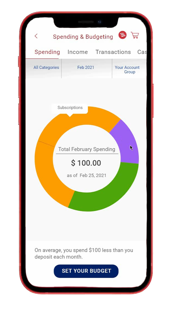
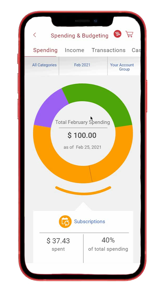
Kathy hit the track spending option in the dashboard to check the total amount spent on subscriptions in a month.
Challenge 2:
Balancing Design with Existing UI Patterns
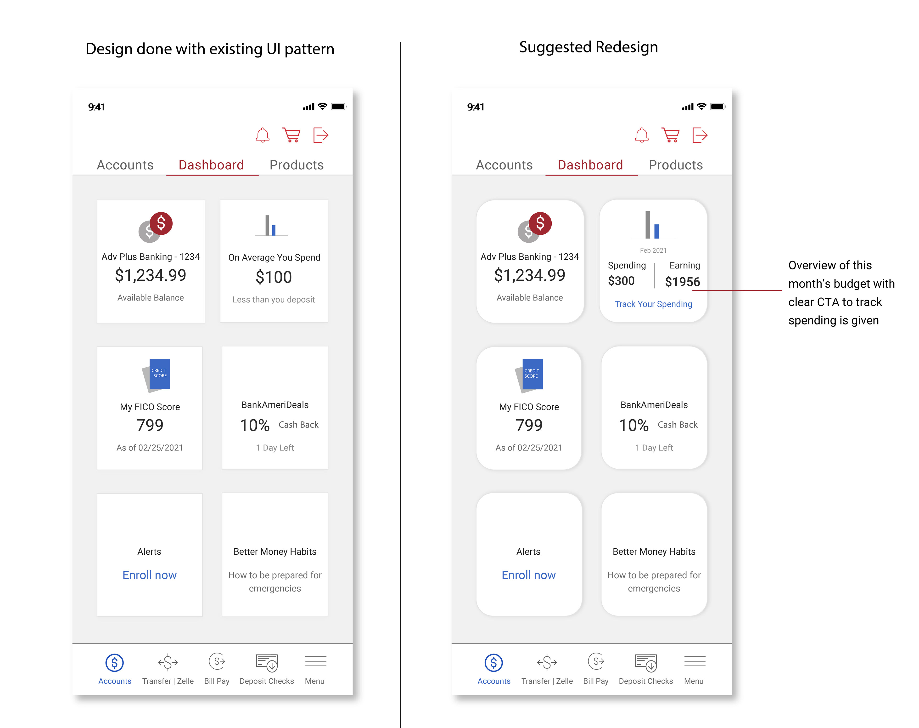
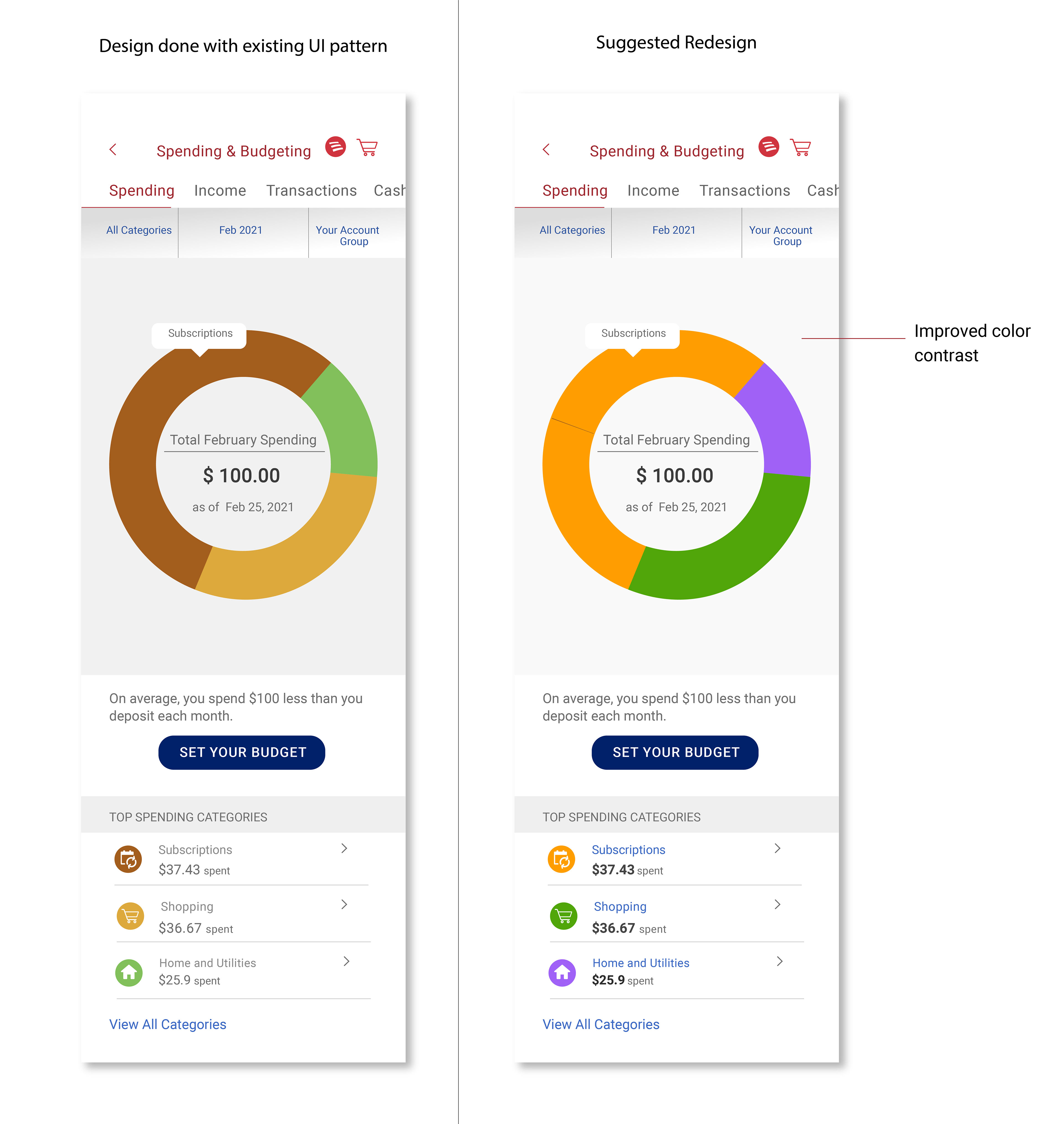
Integrating the subscription tracker seamlessly meant respecting established BOA user interface (UI) patterns, while also addressing some usability concerns:
1. Cost Visibility: The current UI places subscription costs below the category, making them less prominent. My redesign prioritizes cost by highlighting it alongside the subscription name. Users need clear and immediate access to key information, supported by a color scheme and font combination that promotes intuitive navigation and prioritizes essential elements.

Budgeting Accessibility: The existing dashboard screen doesn't readily display budgeting options. To address this, I propose a redesigned version featuring a clear call to action (CTA) for tracking spending, along with a helpful overview of the user's monthly budget.
Color Contrast Deficiency: The current spending and budgeting chart uses colors with low contrast, potentially hindering users with color blindness. Good color contrast is crucial for usability and readability, so the redesign incorporates a color palette that ensures accessibility for all users.
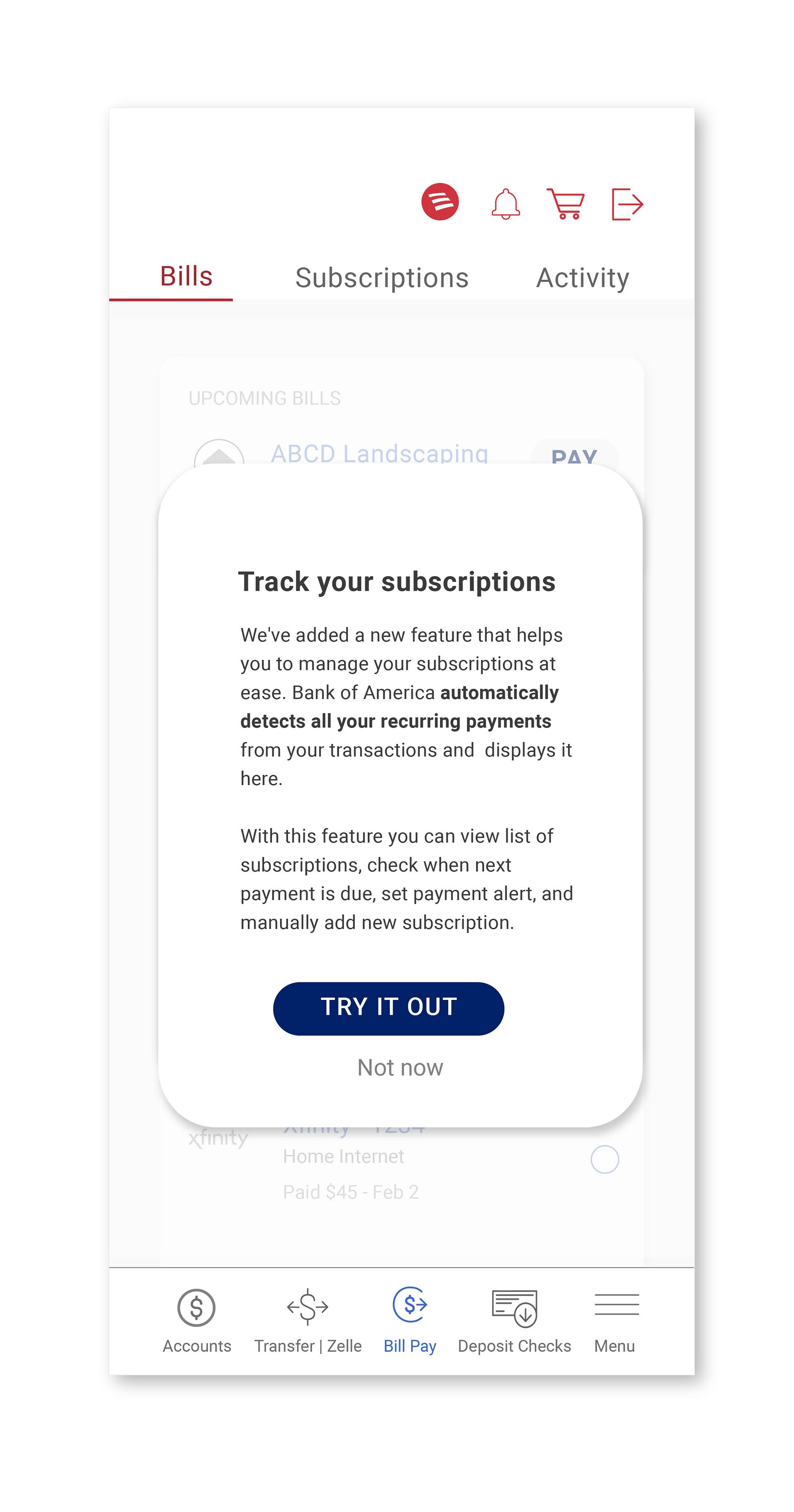
challenge #3
Feature Onboarding for Newbies
I had a confusion about which feature discovery option would work best for this app whether it is Progressive onboarding or pop-up explanation or a Tooltip.
After weighing options, I chose a contextual pop-up. It gently explains the feature's benefits and nudges
users to explore.
After weighing options, I chose a contextual pop-up. It gently explains the feature's benefits and nudges
users to explore.

Conclusion
Outcome
A Winning Design: This project successfully achieved all the micro-goals, resulting in a well-designed feature to track subscriptions. The project's success was further validated by winning first place in the UX Design Contest 15.
Lessons Learned
Timeboxing Triumph: Timeboxing proved to be a powerful tool for prioritizing tasks and boosting overall productivity. Breaking the project into manageable sprints allowed for completion within a 4-week timeframe.
Understanding the BOFA Ecosystem: Spending time analyzing the BOFA app's user flows, information architecture, and visual design ensured the new feature seamlessly integrated with existing brand guidelines.
Areas for Improvement
Scalability Considerations: The current design caters well to users with fewer subscriptions (less than 6). Future iterations should address scalability challenges to accommodate a wider user range.
Expanding User Testing: Conducting user tests with a larger participant pool (over 6) will generate more comprehensive results and help refine the design further.
Website Integration: Considering that many users prefer laptops and tablets for financial transactions, extending the feature to accommodate larger screens becomes crucial.