


Project Introduction
Background
As part of the User Research specialization course, the students were asked to conduct user testing on the travel booking website of their choice. I chose the Priceline website for this project as I faced issues while booking flights and hotels using this site.
About:
Priceline.com is one of the world’s largest travel booking websites that has sold more than 100 million tickets since its launch. The website is well known for its better price that allows customers to save more when booking a flight or hotel.
Priceline.com is one of the world’s largest travel booking websites that has sold more than 100 million tickets since its launch. The website is well known for its better price that allows customers to save more when booking a flight or hotel.
What I did?
User experience of the site is vital to ensure a smooth booking process. Remote moderated user testing on this website was conducted with three participants and the key issues were identified. Redesign recommendations are included to address these critical issues and to improve the overall user experience of Priceline.com.
User experience of the site is vital to ensure a smooth booking process. Remote moderated user testing on this website was conducted with three participants and the key issues were identified. Redesign recommendations are included to address these critical issues and to improve the overall user experience of Priceline.com.
Role
This is an independent project and is not affiliated with Priceline.com. I focused on analyzing the Priceline.com user experience for planning the itinerary while finding opportunities to improve the flight search interface.
Project Type, Duration
Self initiated individual project , 3 weeks

The Problem
Though Priceline is one of the popular websites it is not the "go-to" website for many to book tickets. A quick online study revealed that there are some issues when it comes to understanding the cost of the trip and searching for hotels.

Target users
Travelers are students, business people, & professionals between the ages of 25-50.
They generally use these websites to plan their vacations and business trips. They use multiple travel sites to research flight options and choose based on the lowest price. These travelers prefer a simple website with a transparent and trustworthy booking process.
They generally use these websites to plan their vacations and business trips. They use multiple travel sites to research flight options and choose based on the lowest price. These travelers prefer a simple website with a transparent and trustworthy booking process.

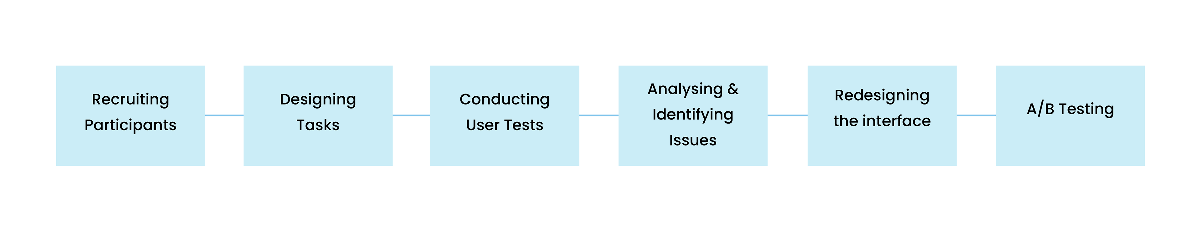
THE PROCESS
Scope and Constraints
Problem: Because of the limited time and pandemic situation recruiting participants was difficult.
Generally, user tests with over 5 participants yield better results.
Generally, user tests with over 5 participants yield better results.
Solution: The scope of the problem is narrowed to focus mainly on the three most visited webpages. Different user tasks were created to study the experience of travelers using these pages.

Recruiting test participants
Three participants who have not used this site before was chosen.
The recruiting criteria were defined as follows:
• The person should have bought a ticket online in the past year
• The person has not used this site before
Due to the limitations of this unprecedented situation the participants were limited to family members and friends who have bought at least one plane ticket using an online booking site. The chosen participants were between the ages of 25-40. Within this population, a certain diversity criterion was set to understand how different types of users will experience the site.
The 3 recruited participants differ along these two dimensions:
• Flight preferences
• Frequency of online bookings
Based on these criteria three people were shortlisted.


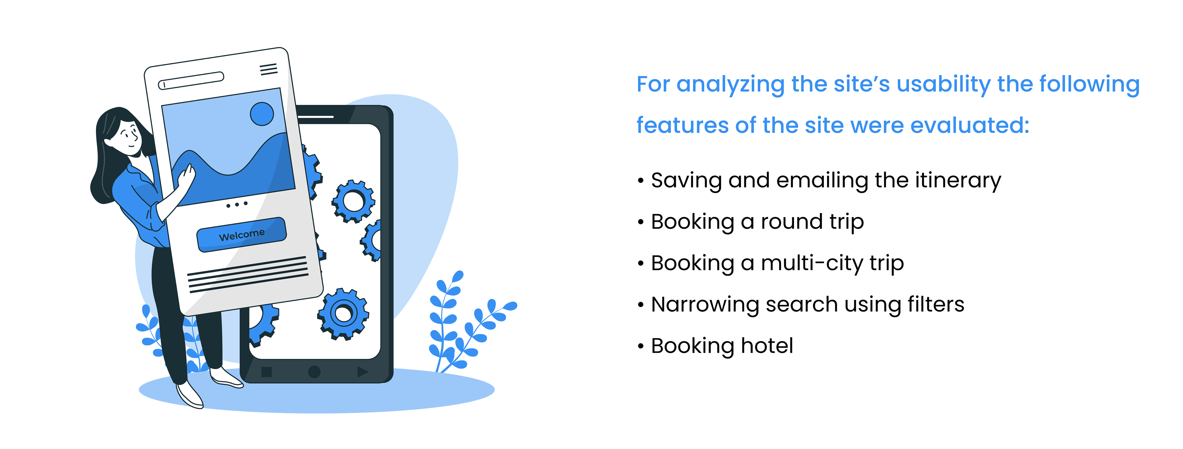
Designing Task
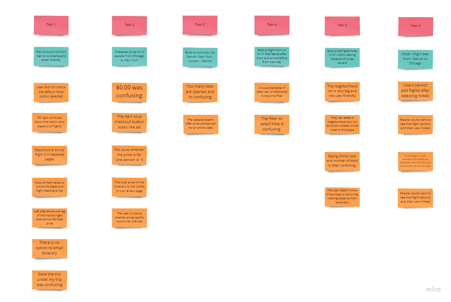
A total of 6 tasks were designed that included finding cheap flights, saving and sharing itineraries, and booking hotels using the Priceline website.
Through brainstorming, a lot of task ideas were generated and a total of six tasks were chosen for this user test. The tasks were arranged by the order of difficulty - easy to hard. Before the test, all the tasks were run once by me to find the specific outcomes as well as verify the success rate when conducting the user test.

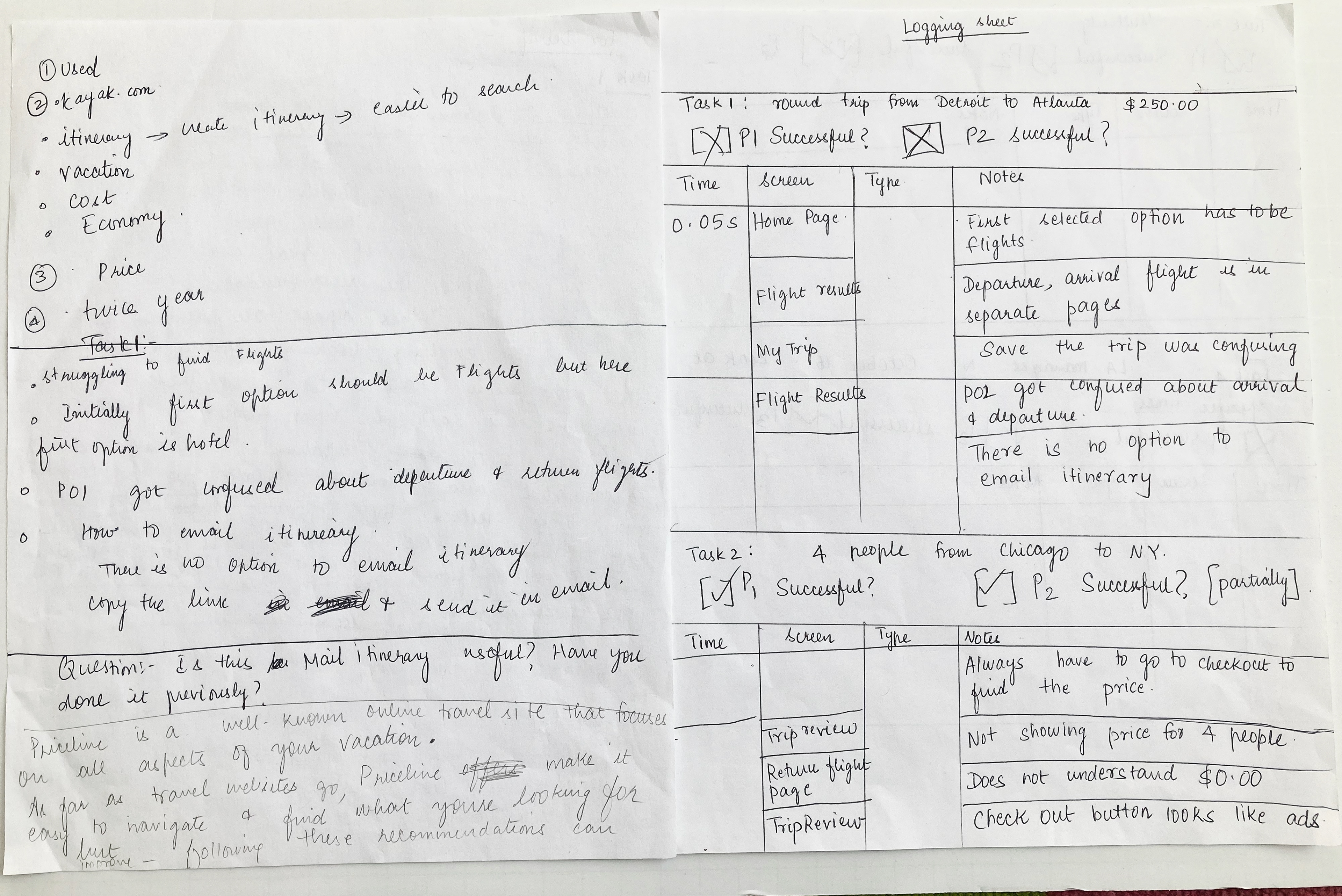
Conducting User Test
All the six tasks were performed by each participant for an average duration of 40 minutes.
Each participant was given an introduction about how the session will be conducted and some general instructions. A pre-test survey was conducted to determine their demographics and level of expertise. A post-test survey along with a debriefing session was conducted to gather additional feedback.
Screen recording software QuickTime was used to record the interactions of the user during the testing.

Analysis & Reporting
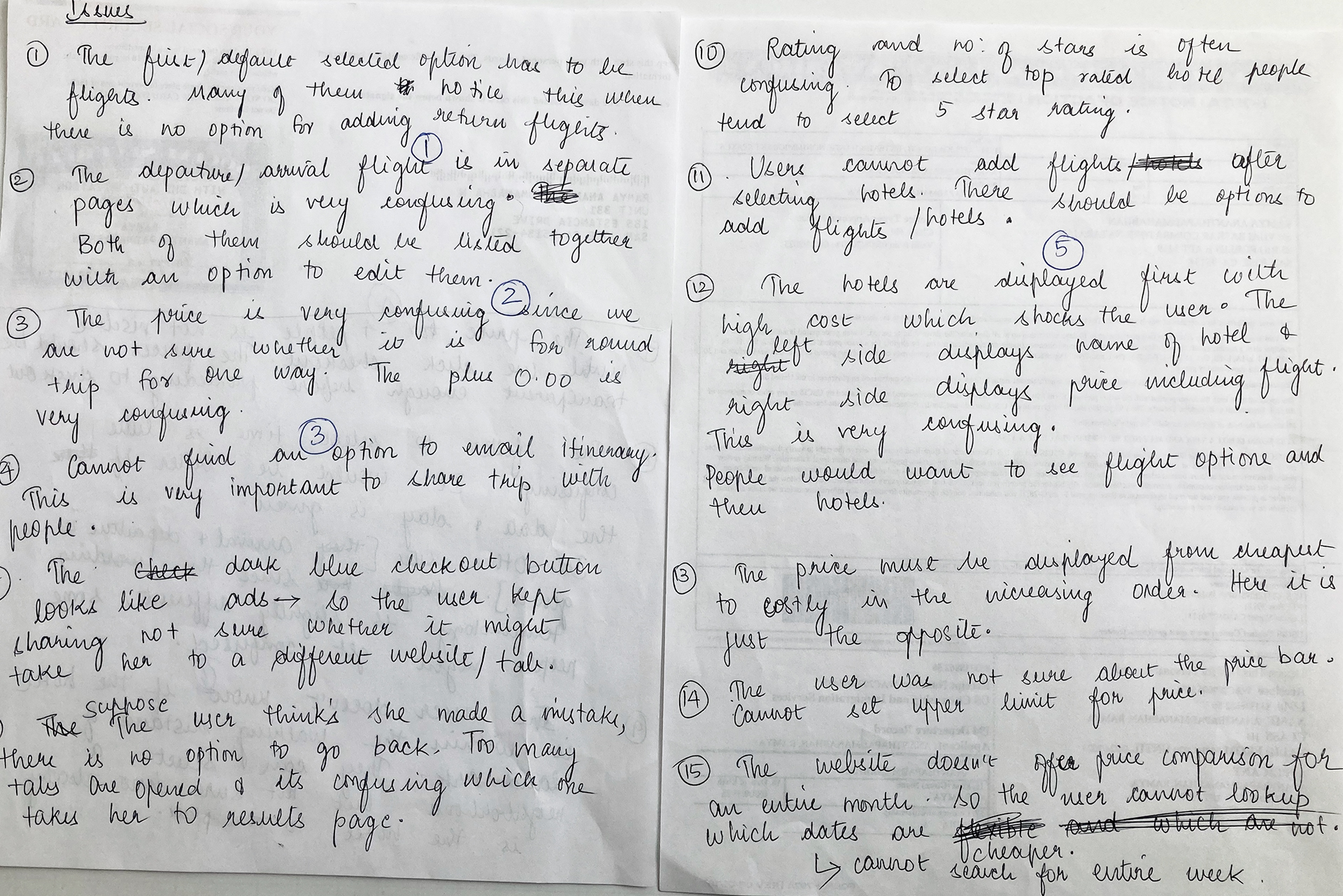
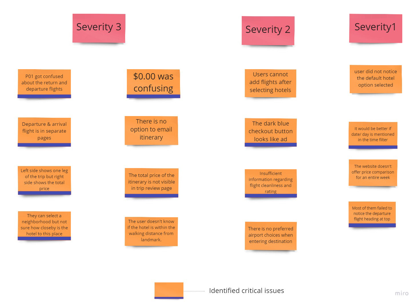
Similar issues were grouped and five critical issues were identified.
Similar issues were grouped and five critical issues were identified.
After populating all the recordings, logging sheets, notes, and questionnaires the results were categorized based on the recurring themes. The online tool Miro was used for the analysis.

Summary of Results
Overall the usability of the site is good but certain features conflict with the mental model of the participants.
Overall the usability of the site is good but certain features conflict with the mental model of the participants.
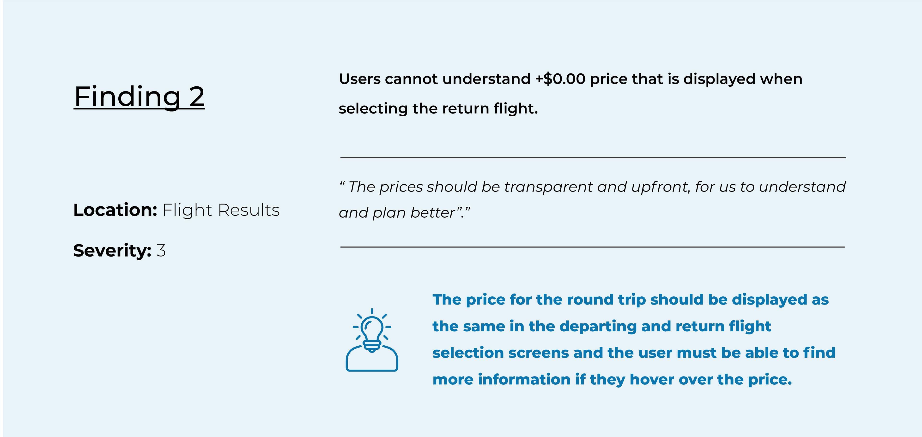
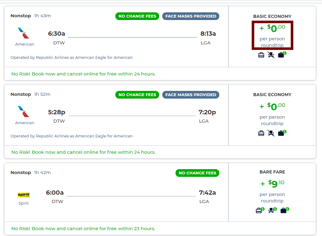
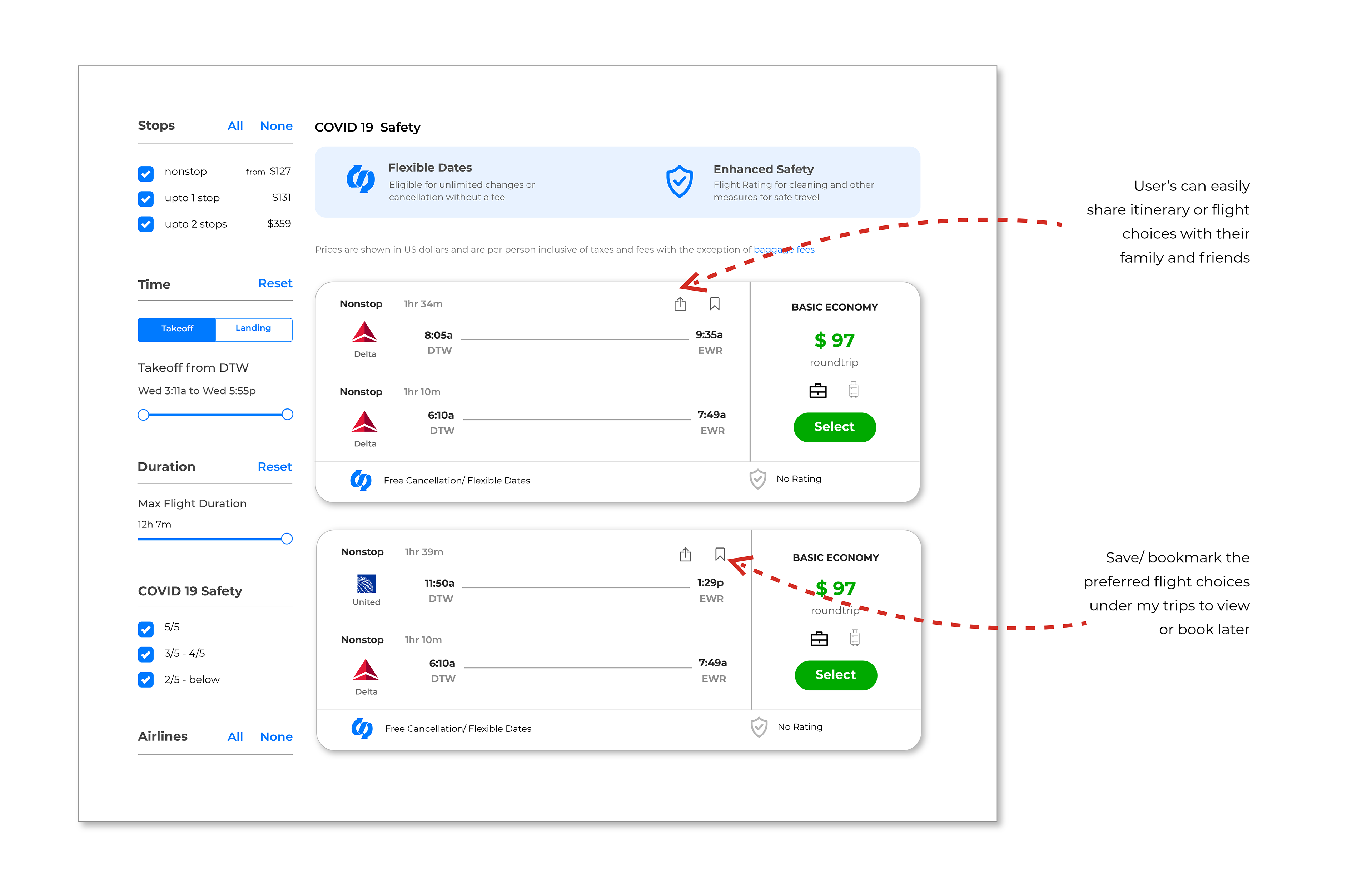
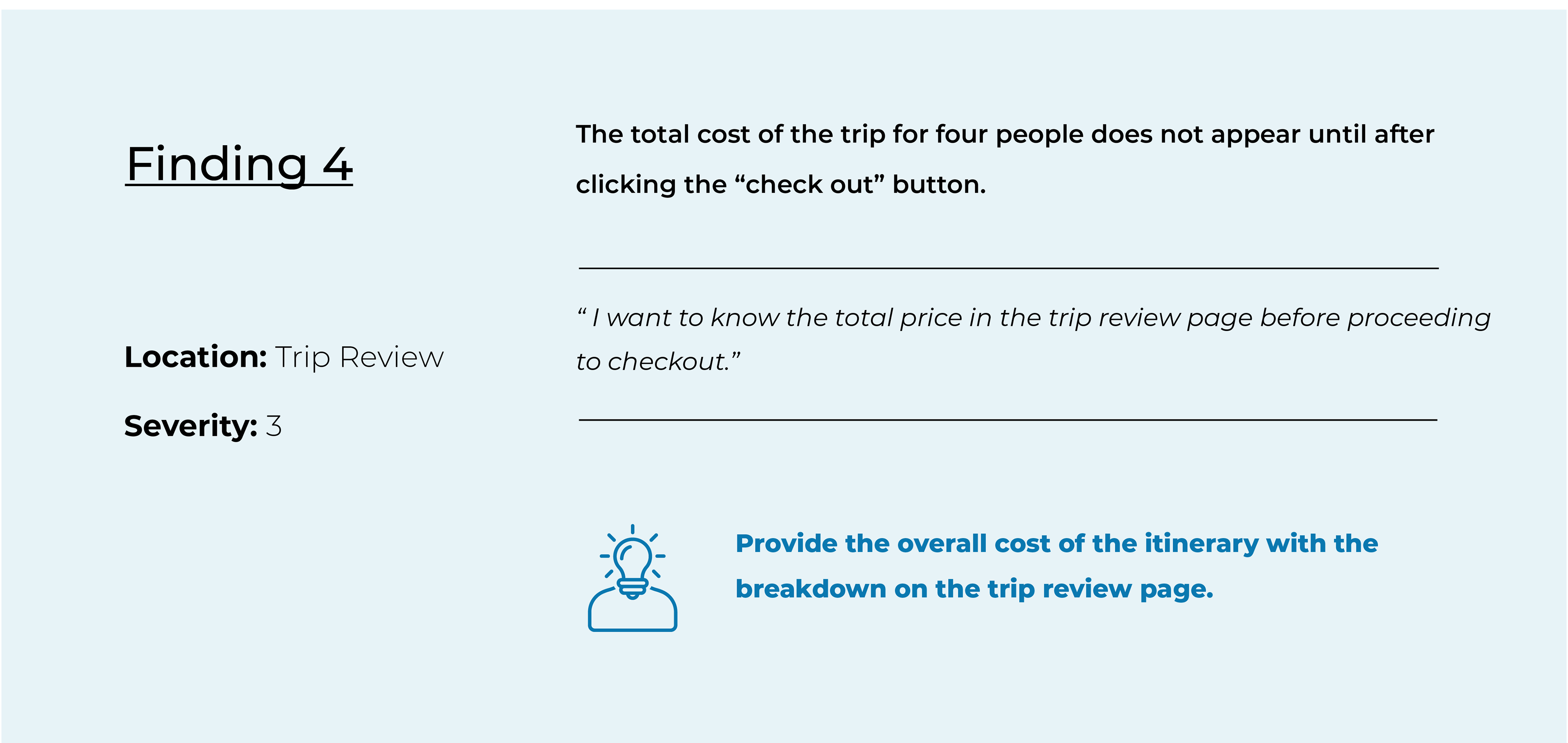
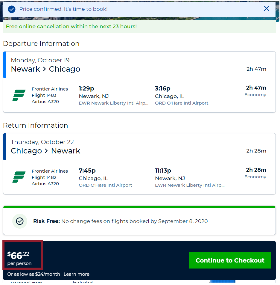
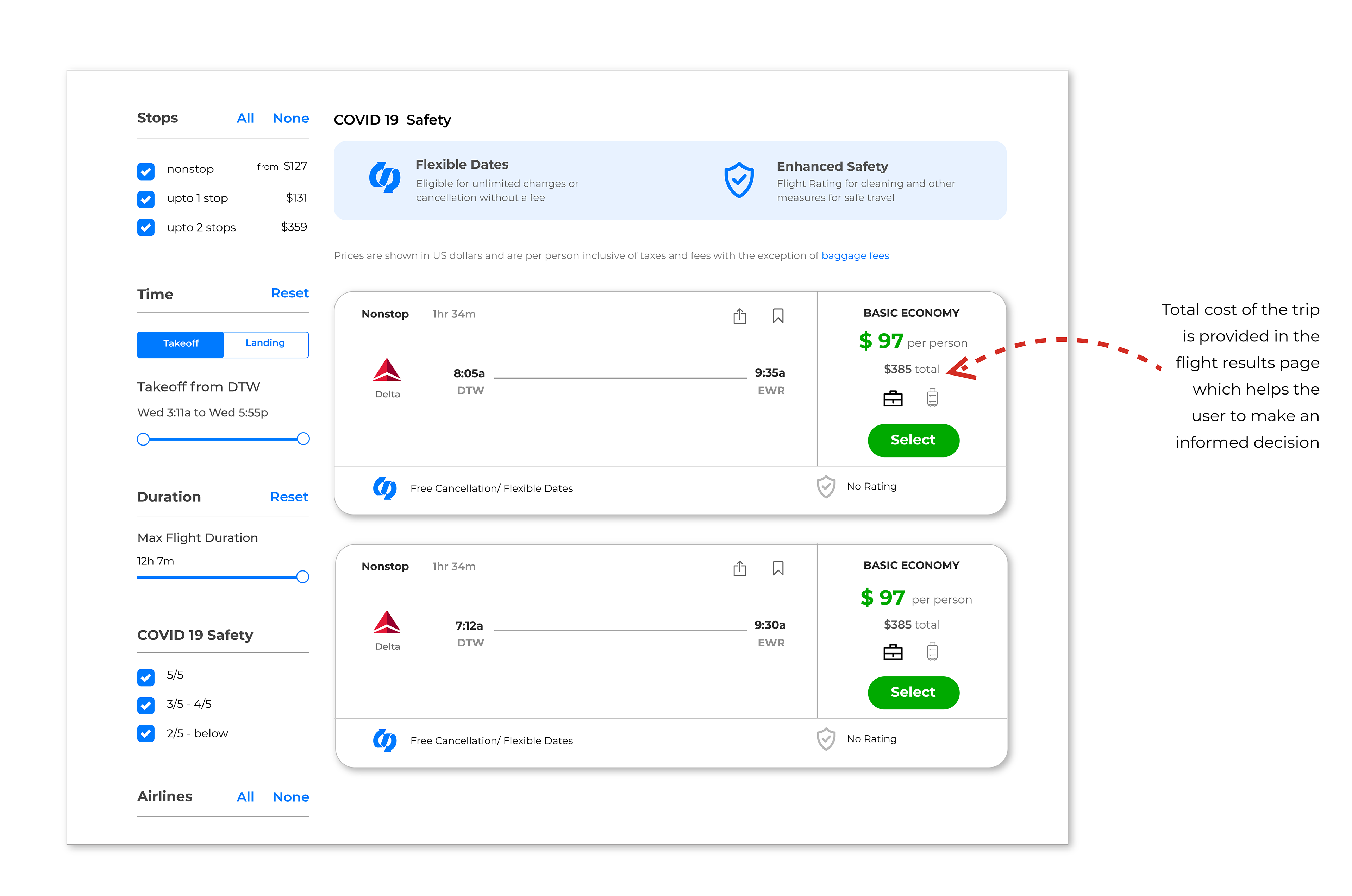
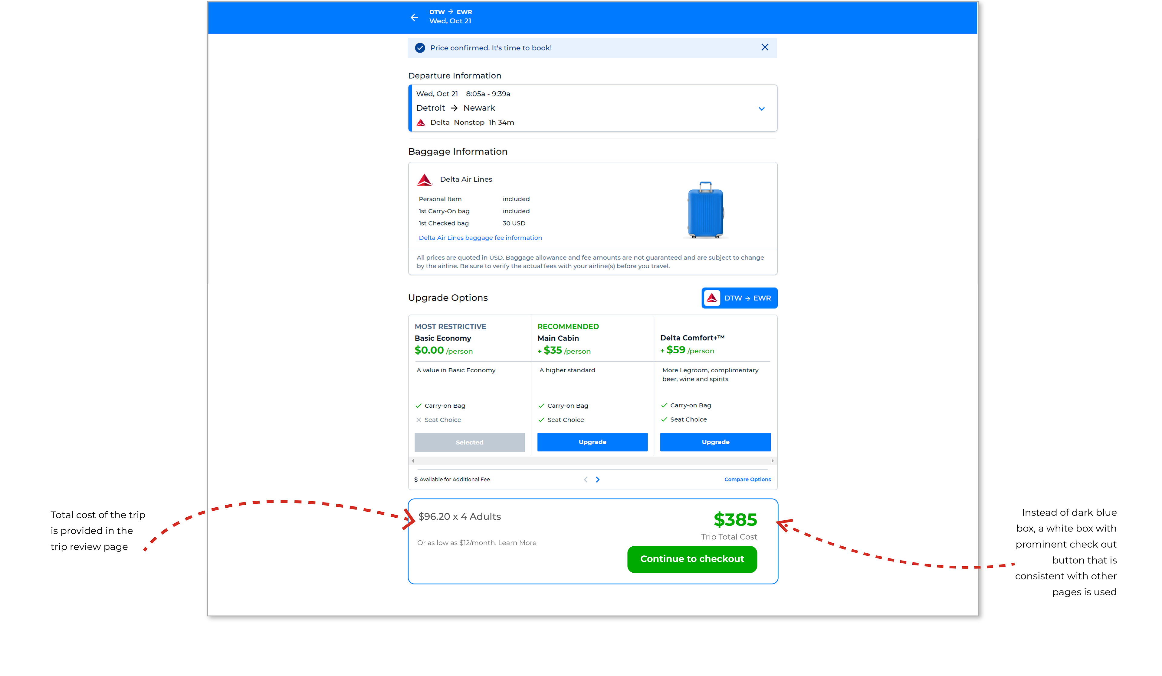
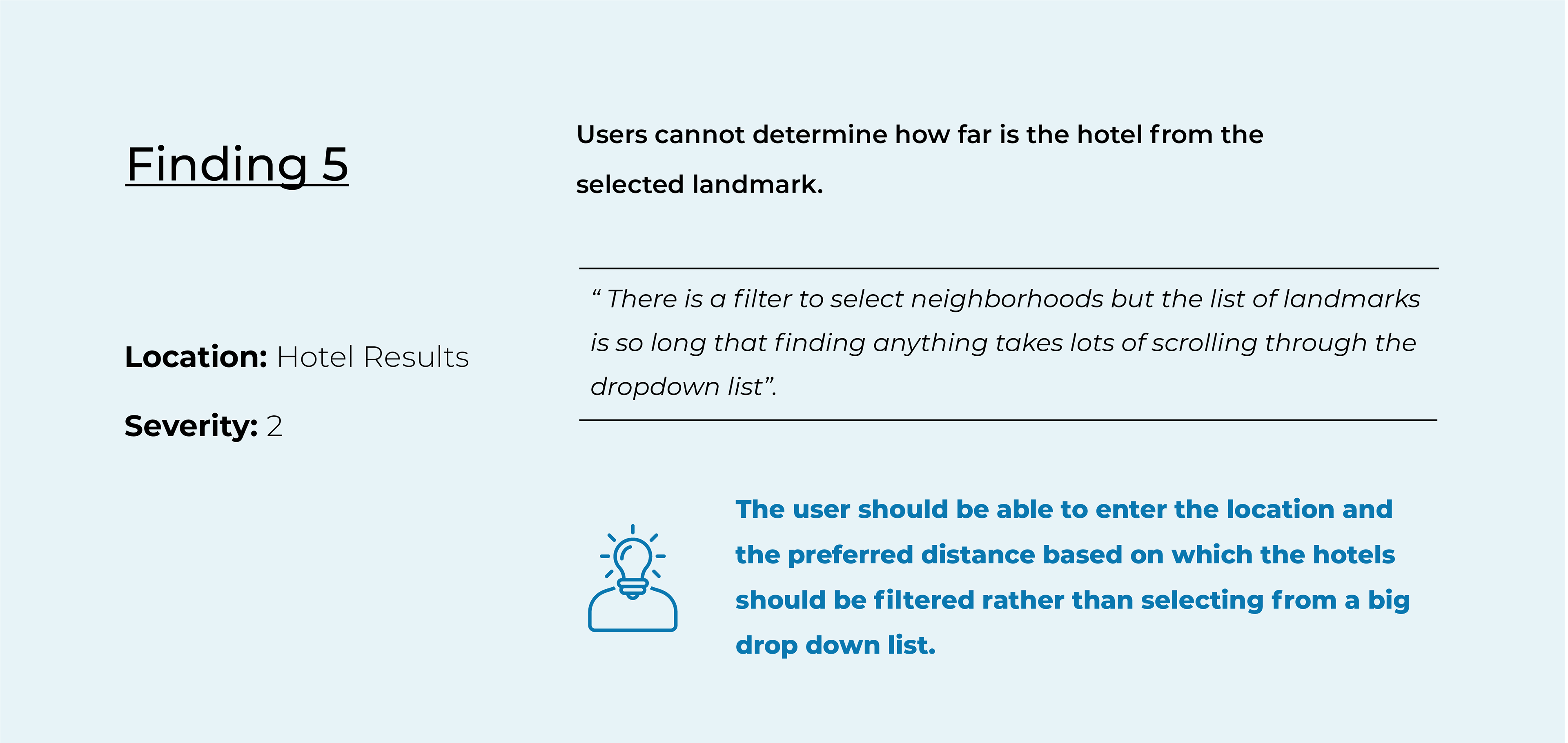
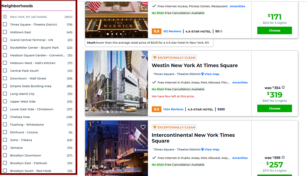
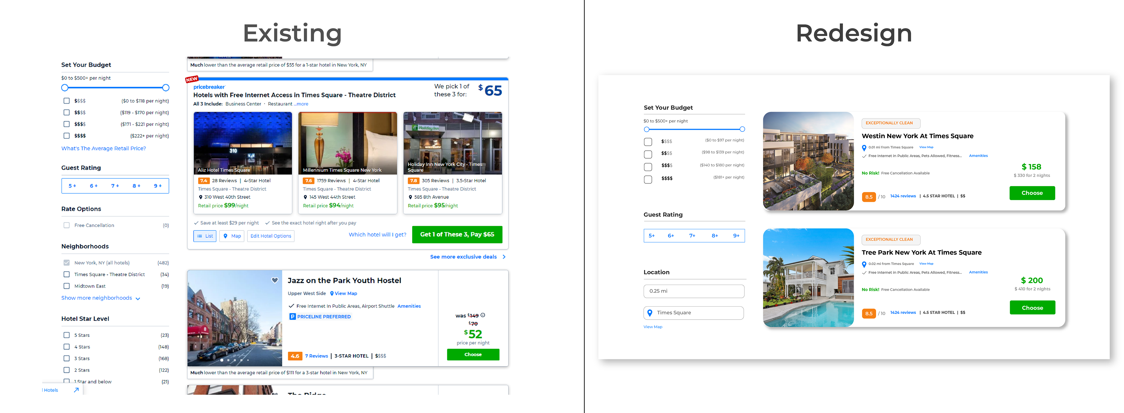
1. Everyone found it difficult to understand the price breakdown of the round trip.
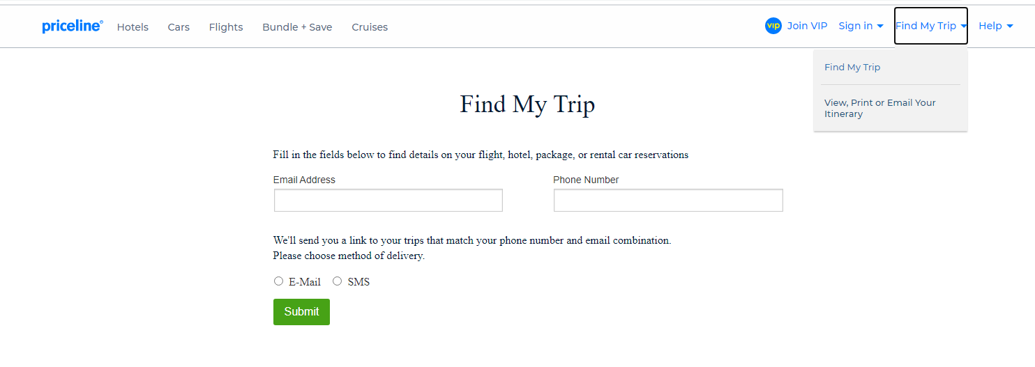
2. Almost all the users were unsuccessful in finding the email itinerary option.
2. Almost all the users were unsuccessful in finding the email itinerary option.
The main issues are categorized based on their severity.
1= cosmetic problem; no real usability impact
2 = minor usability problem; fix if there is time’
3 = major usability problem; important to fix
4 = usability catastrophe; imperative to fix
The quotes from the participants are included as evidence to support critical issues.
P01 for participant 1, P02 for participant 2, P03 for participant 3.
2 = minor usability problem; fix if there is time’
3 = major usability problem; important to fix
4 = usability catastrophe; imperative to fix
The quotes from the participants are included as evidence to support critical issues.
P01 for participant 1, P02 for participant 2, P03 for participant 3.

FINDINGS & RECOMMENDATIONS


Design Solution
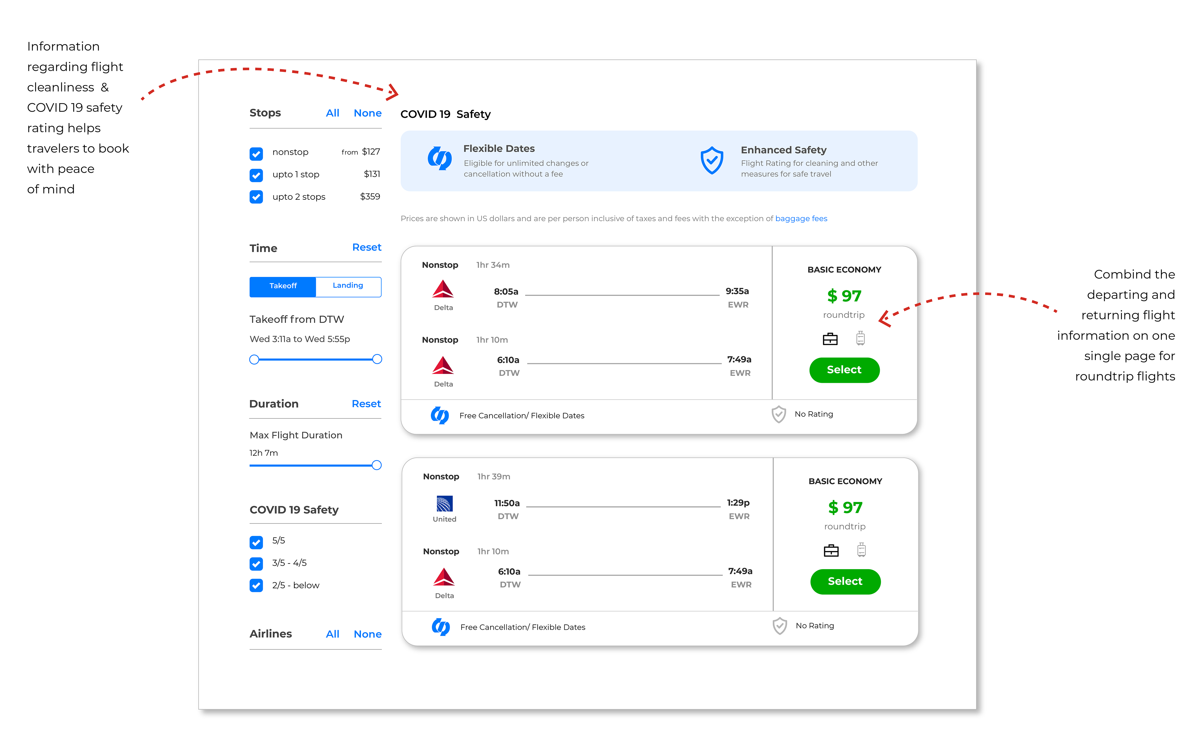
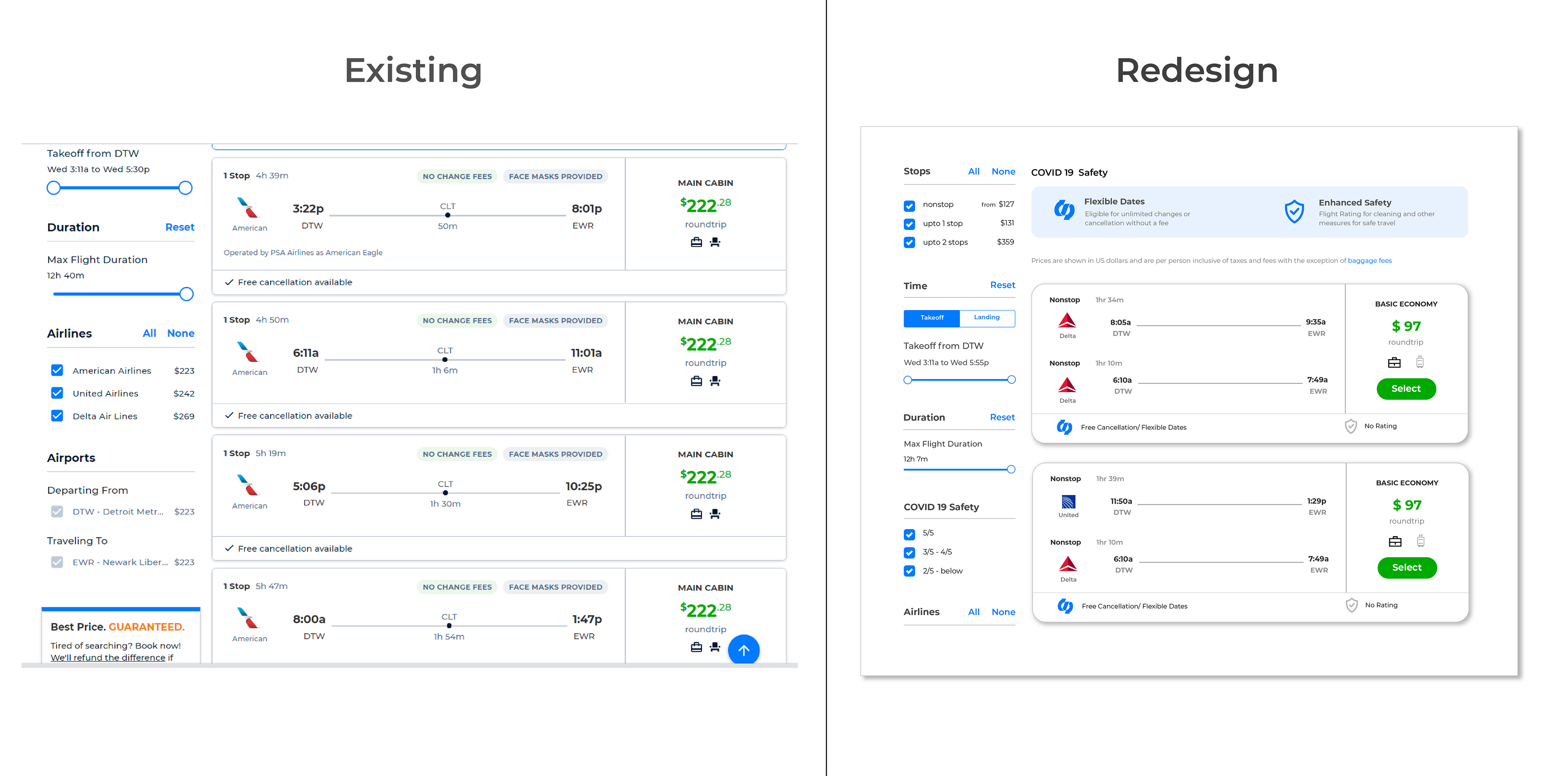

Design Solution


Design Solution

Design Solution
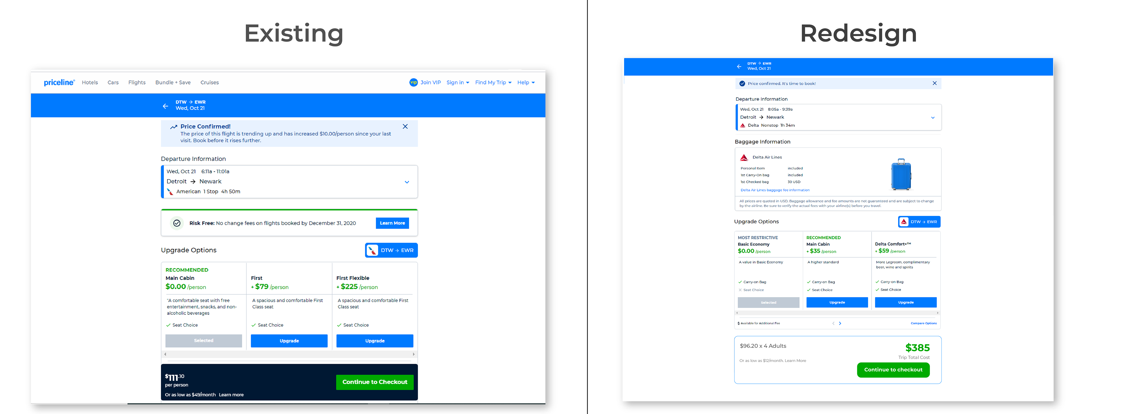

Design Solution


LEARNING & OUTCOME
A/B Testing Outcome
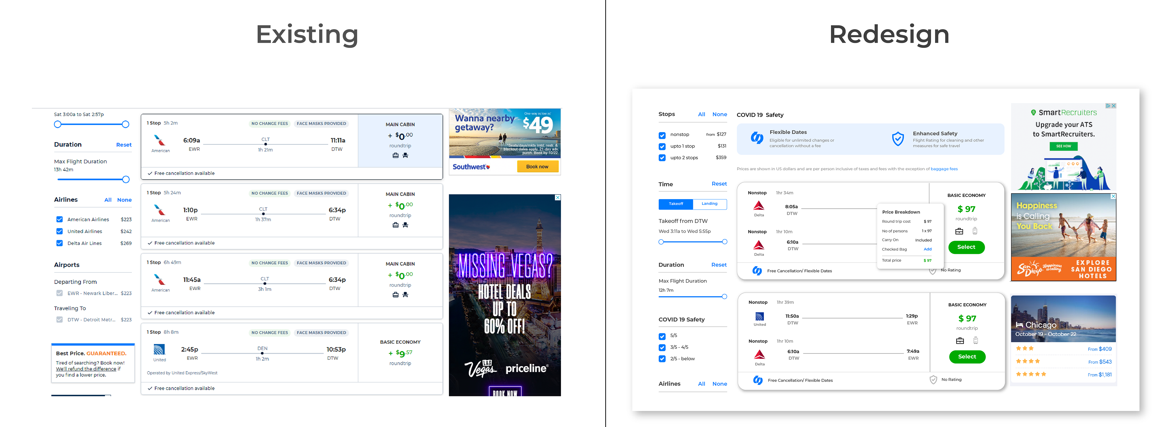
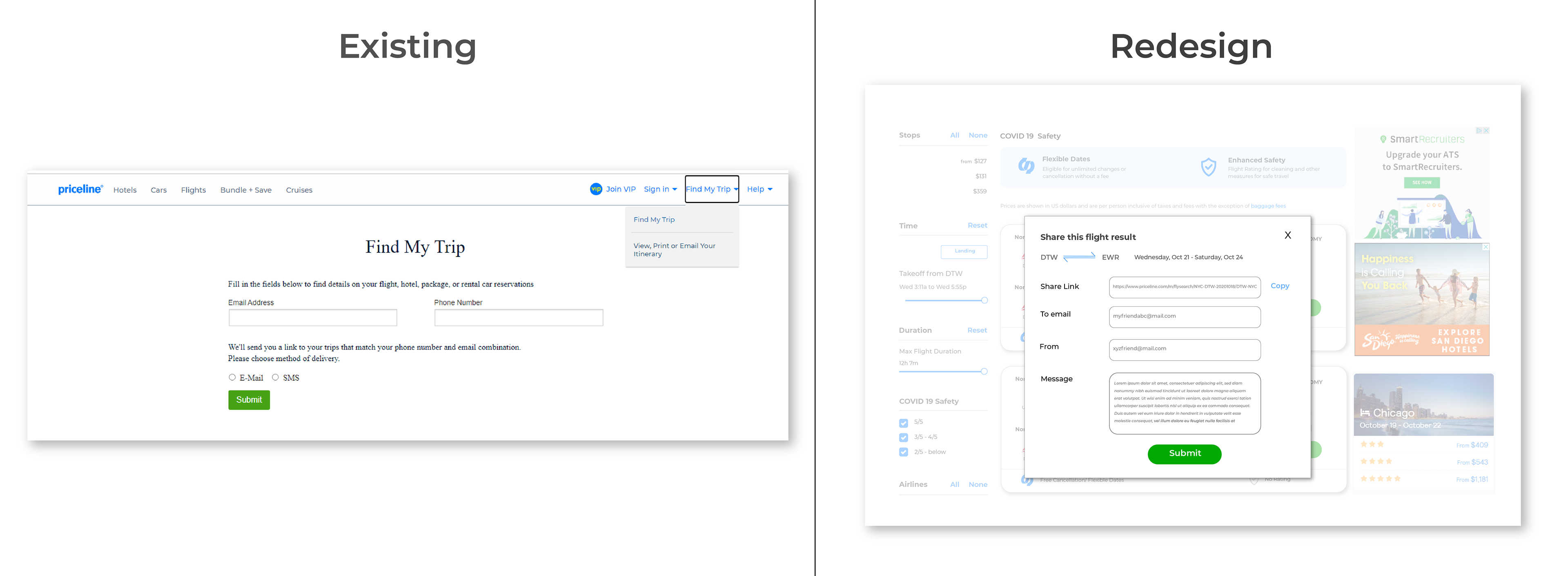
User's found the redesign 100% improved and easy to understand.
A/B testing was conducted with the existing and redesign versions with the same participants who did the testing previously.
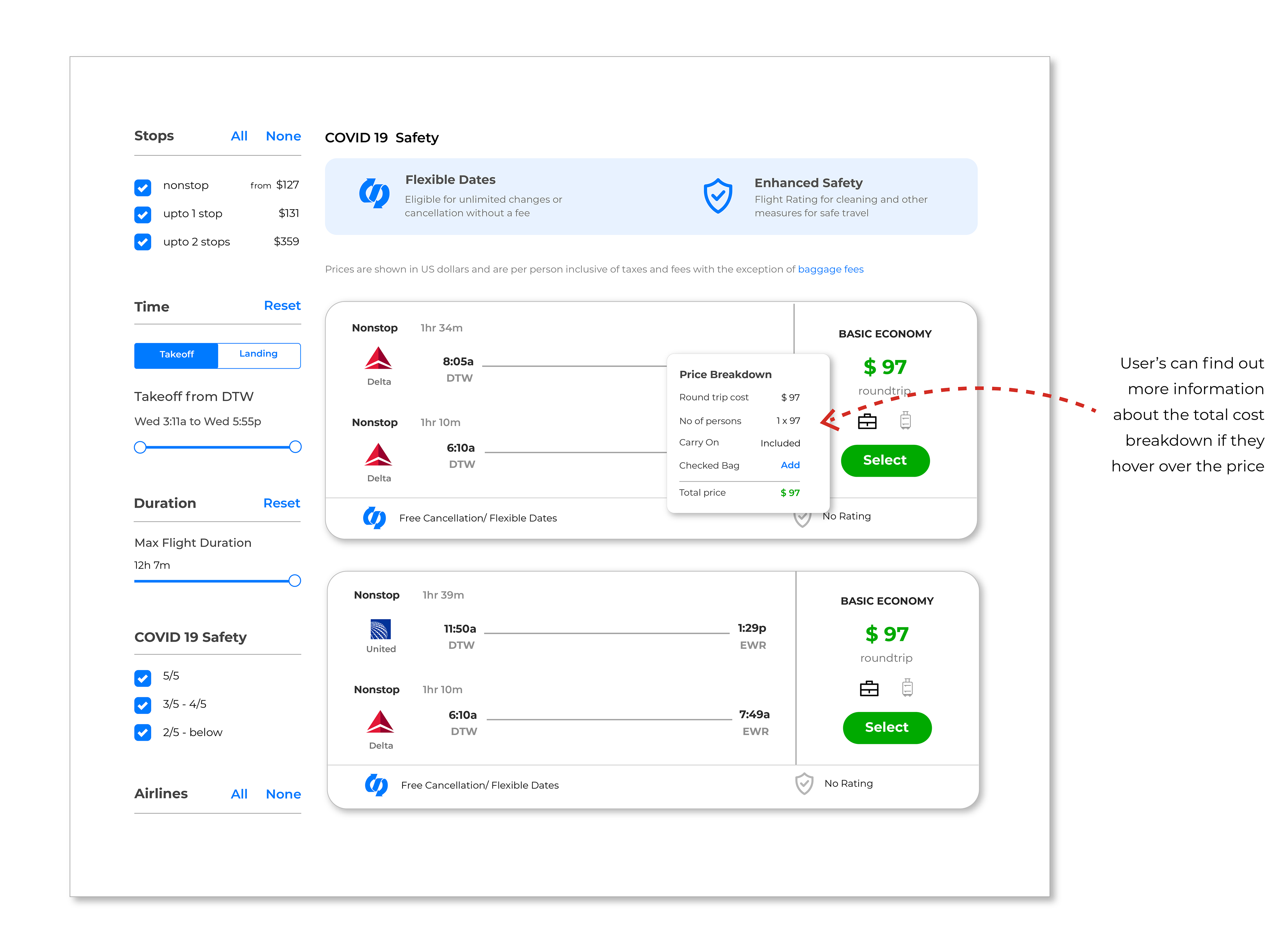
1. All the users felt the price breakdown is very clear in the redesigned version.
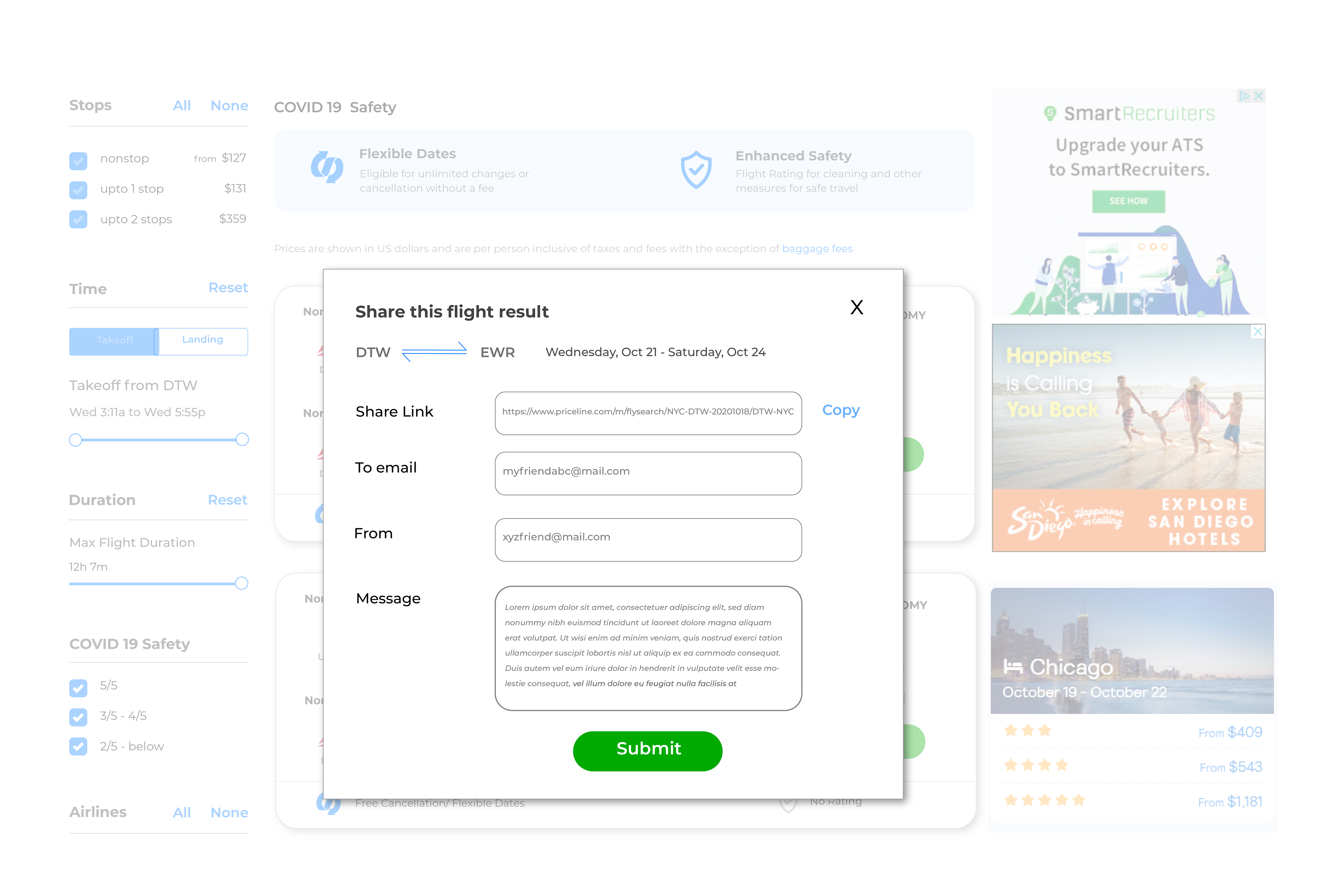
2. They found it very convenient to share and email the itinerary.
The redesign version overall improved the trustworthiness of the site. Since Priceline is already famous for its cheap price and best deals fixing these issues will improve their user retention and conversion rate.
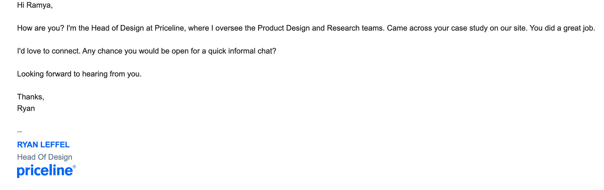
Validation from Head of Design, Priceline
My user-centered redesign of the Priceline website impressed the Head of Design, who reached out to acknowledge the positive impact.
Learning
I understood that User testing is a very powerful tool that helped me understand which parts of the design frustrate people, where they get confused, and what keeps them from converting.
1. Travelers have their preferred choice of website for planning itineraries and often stick to that choice.
2. They use the other sites for just price comparison and deals but prefer to book from airline sites like delta, united, etc.
3. Small barriers or issues complicate the booking process that reduces the trust in that travel website.
Next Steps
Due to the limited time, only certain issues were brought into the spotlight. Many other issues need to be addressed in the next version.
