Cromatic - Visual Design
Visual Illustration System for a Biotech SaaS Platform
(Only a subset of the work is shown due to NDA and a later company rebrand)
OVERVIEW:
I collaborated with Cromatic, a US-based biotech SaaS startup, to create a flexible illustration system that simplified complex scientific workflows into clear, engaging visual narratives. These visuals were designed for use across product pages, blogs, sales decks, and customer education materials.
Cromatic’s core audience included biotech and pharmaceutical companies, so the illustrations needed to speak to a highly technical audience while still feeling modern, intuitive, and easy to digest.
ROLE:
Freelance designer working on - Visual communication strategy - Illustration system design - Color palette
exploration - Homepage collaboration - Working alongside Product + Marketing under tight timelines
DURATION:
1 month
CLIENT:
Cromatic Biosciences
The Challenge
Biotech R&D involves dense processes, specialized terminology, and long chains of vendors and experiments. The team needed a visual language that could: Communicate complex scientific workflows at a glance, Reduce cognitive load for technical readers, Reflect the brand’s SaaS identity while still feeling credible to scientists, Support storytelling across marketing and product touchpoints
Solution - Simplifying complex technology through visual storytelling
Instead of representing scientific processes literally, I leveraged system-based visual metaphors inspired by platforms such as Stripe and Science Exchange. My goal was to show how the platform worked without exposing proprietary workflows.
1. Process-first storytelling: Each visual shows a simple, circular or linear system depicting:
biotech/pharma → outsourcing tasks → vendor execution → results returning to the client. This preserved conceptual understanding without revealing any confidential mechanics.
biotech/pharma → outsourcing tasks → vendor execution → results returning to the client. This preserved conceptual understanding without revealing any confidential mechanics.
2. Soft gradients + geometric shapes: These serve as neutral anchors to “hold” complex ideas without
overwhelming the viewer.
overwhelming the viewer.
3. A clear sense of flow: I designed all illustrations with intentional directionality, allowing technical readers to intuitively follow the narrative from input → process → output.
Color and style explorations:
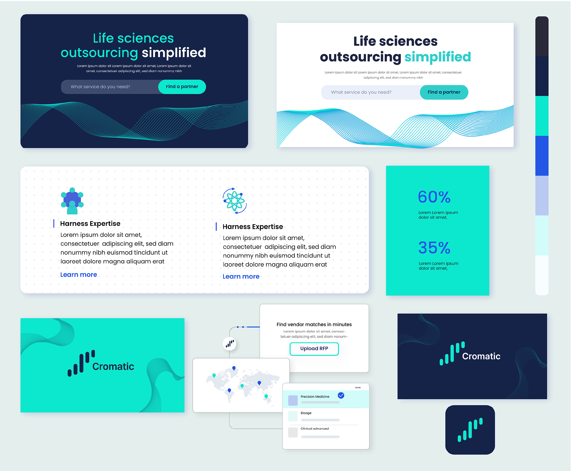
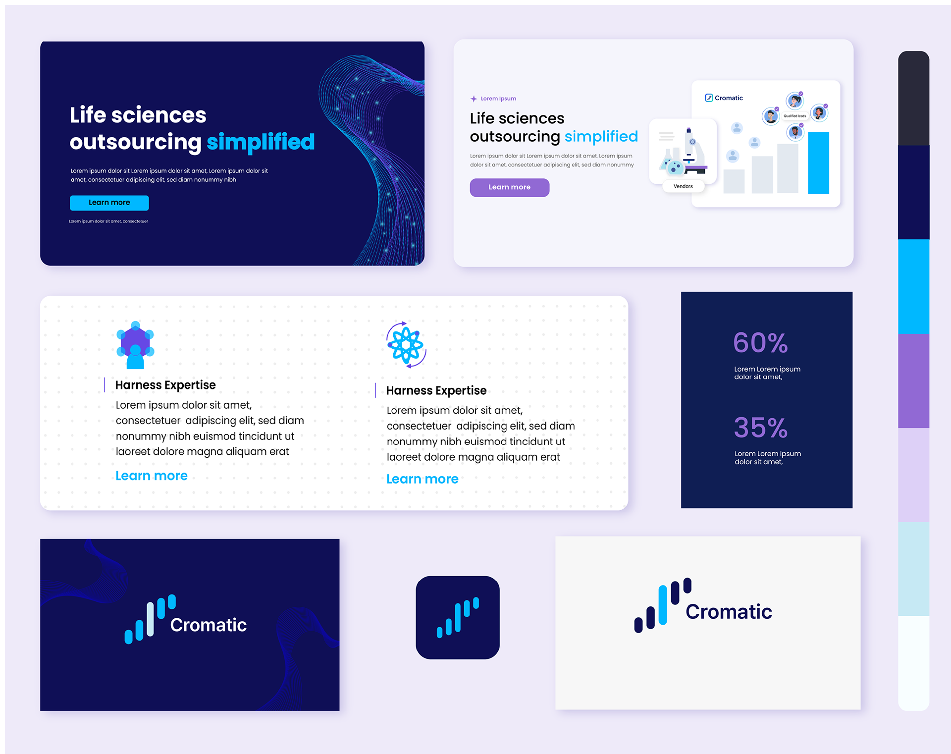
Initial palette studies created to explore how different moods—clinical, bold, or friendly—could shape the
brand’s visual voice. I created quick sample illustrations to show how the proposed palette could translate into a clear, scalable visual system.
brand’s visual voice. I created quick sample illustrations to show how the proposed palette could translate into a clear, scalable visual system.

Collaboration With Product Design
Alongside the illustrations, I supported the product team in translating user research into updated visual design concepts for the website. Since the company underwent a major rebrand and product pivot a few months later, these website explorations are not shown here.
Outcome
Cromatic successfully integrated the illustration system across marketing and product touchpoints during the period before their rebrand. Although the visual style is no longer in use today, the work served as a strong foundation for communicating their value to biotech and pharma stakeholders.
What I Learned
This project contrasted sharply with my large-scale experience at Google. Working with a fast-moving startup taught me to: Make quick visual decisions based on incomplete information, Build flexible systems that can evolve rapidly, Collaborate closely across product, engineering, and marketing, Communicate complex ideas efficiently and visually


