Career Education Newsletter
Goals
The contents should be labeled and organized in such a way that the user finds it interesting and able to easily access the information they need.
There should be a clear distinction between different categories like CTA, course information, upcoming event, etc.
The design should be unique and distinct from other in house print materials while following the brand guidelines of Mission College.
The layout should be clean and have a good balance between the images and text.
Design process
Content Strategy
The text for the newsletter was provided from all departments as a 25-page document. Planning the presentation of the content was the first and the most crucial step in designing a successful layout. Discussing with the senior designer and the department chairs it was agreed to refrain from the text-heavy layout and make it visually engaging. The overall contents are divided into the following categories:
1. Did you know?
2. Upcoming events
3. Course listings
4. Link to the department website
The amount of copy in a page was decided based on the user's attention span and grasping power.
Categories of Career Education Newsletter
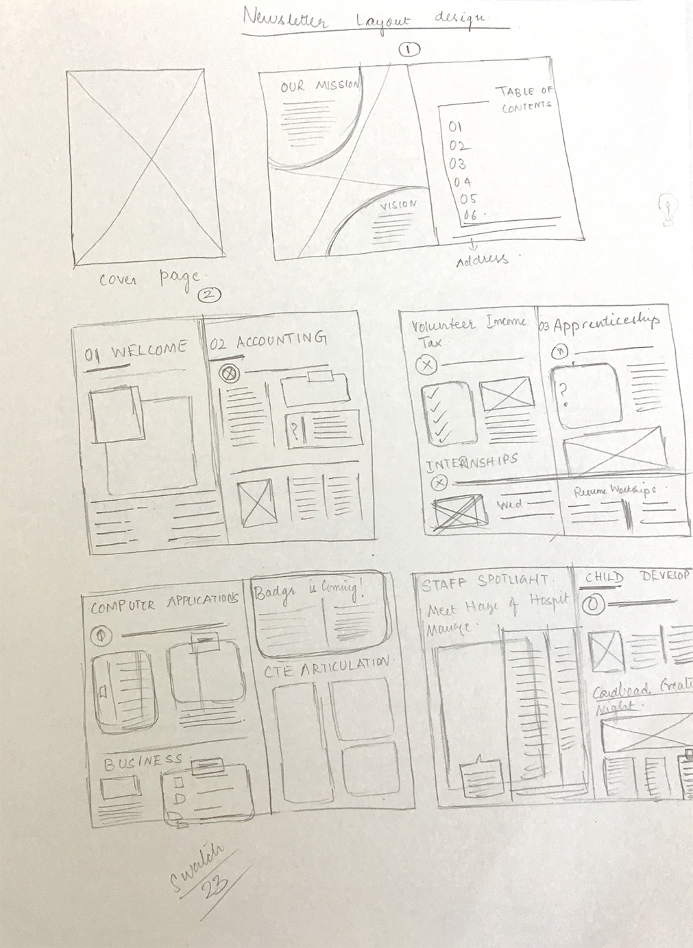
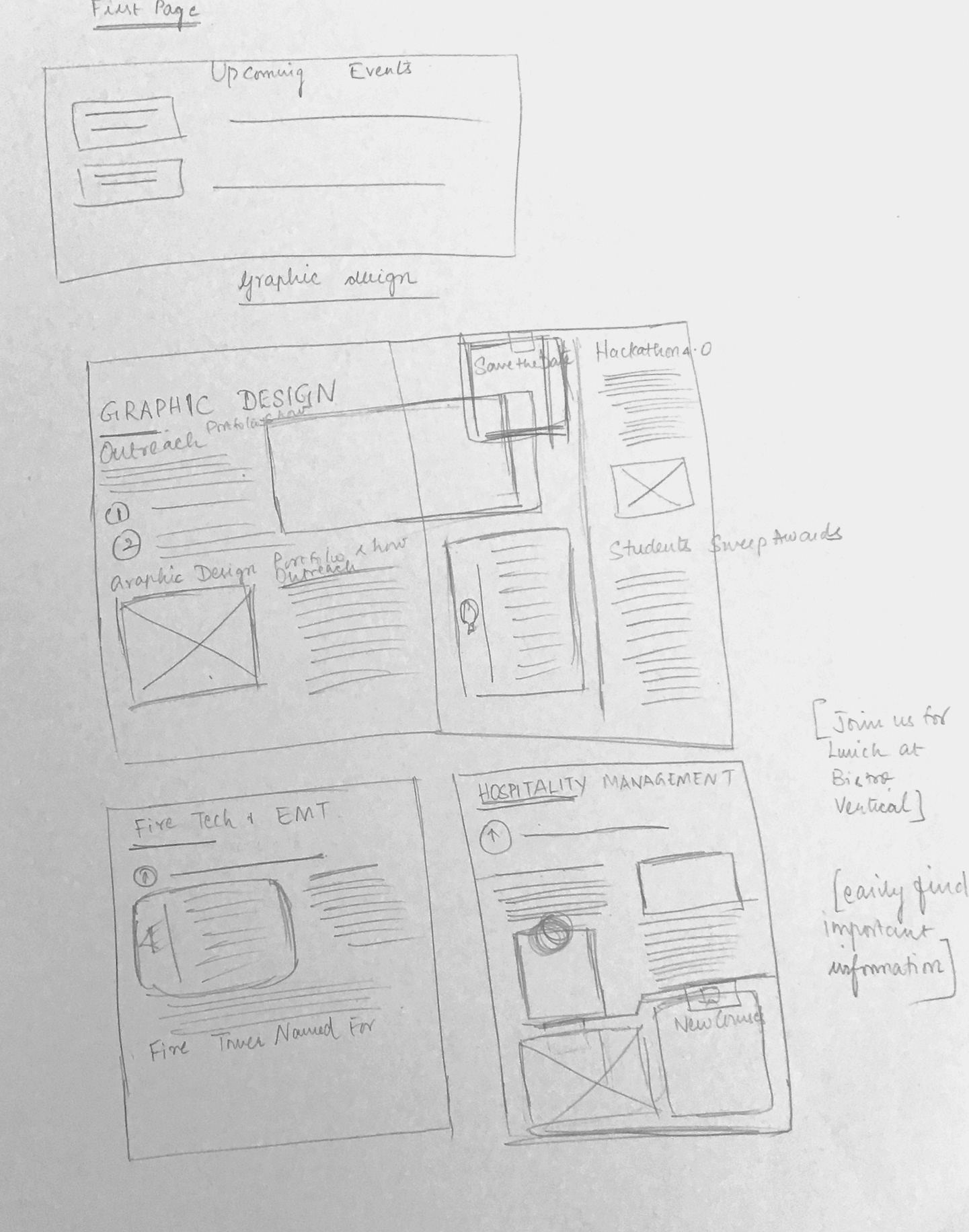
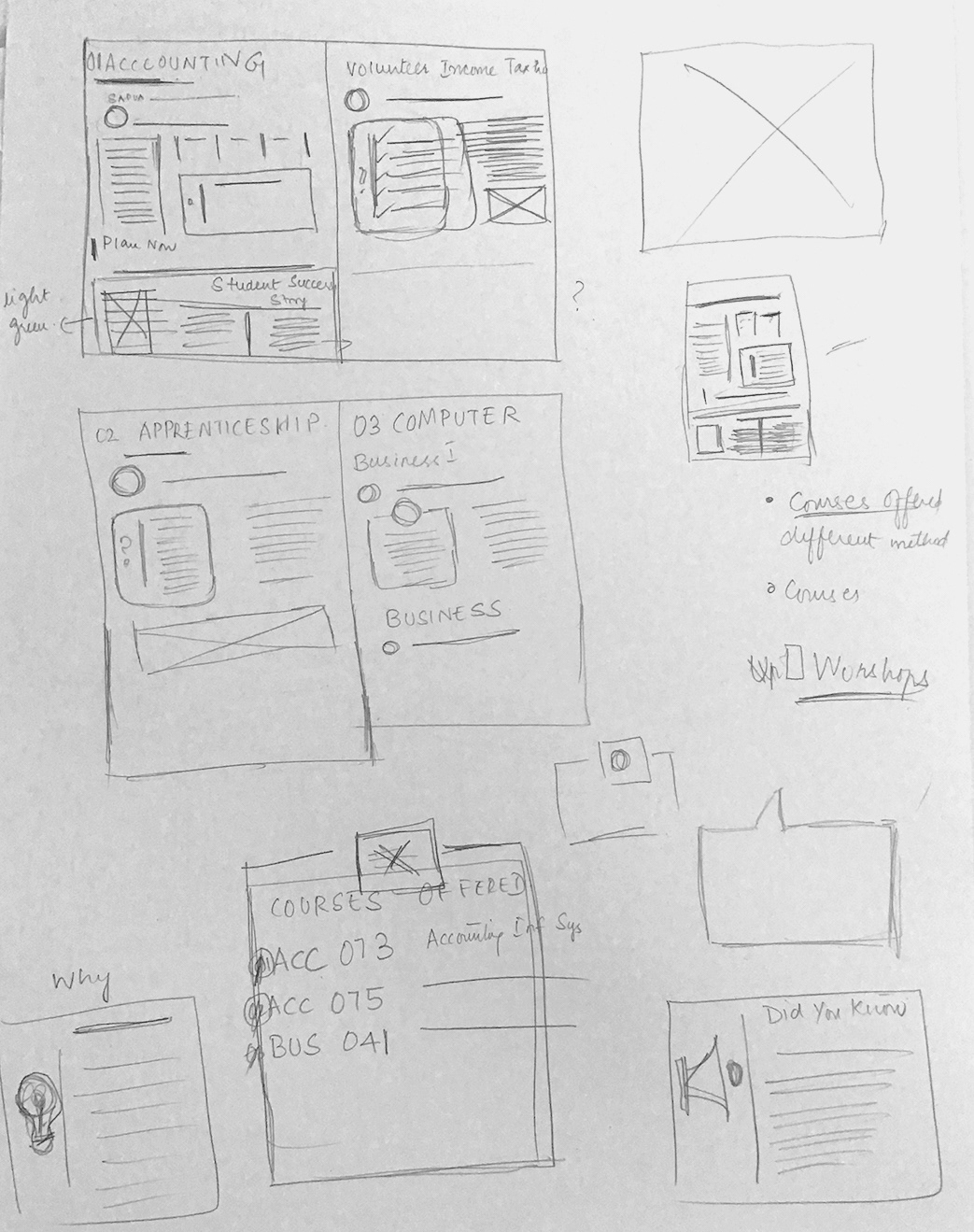
Exploration


Exploration Sketches
Template
After finalizing the content a template was created with margins, color schemes, icons, and text styles.
Newsletter Template
Minimal colors are used to make the pages look classy and simple. The important pieces of information on a page are highlighted using color.
Color Palette & Typography
Style
The consistent style was followed from page numbering to typography to create an identity as well as to make it comfortable for the audience to read.
Cover design
An attention-grabbing cover is vital for inviting the readers and make them delve deeper into the publication. Minimal information like heading, subheading, college logo, images of students, and web address was included in the design. Four different cover designs with placeholder images were presented to the clients.
Newsletter cover designs
Chosen cover design
Interactive newsletter
Outcome
The printed copies were placed throughout the campus and in some public places like libraries and schools. It was
well-received throughout the campus and I got a lot of appreciation from different departments. According to the data from our marketing team the email newsletter was viewed by more than 800 people.
well-received throughout the campus and I got a lot of appreciation from different departments. According to the data from our marketing team the email newsletter was viewed by more than 800 people.
Learning
I understood that having healthy relationships with clients will enhance the creative process. Working as an in house designer taught me how to follow and maintain the company's brand integrity as well as exercise one's creativity.
